Partners Rx
Partners Rx is a prescription benefit manager that engages patients and providers to deliver improved health outcomes.
Client: DocuPrint Solutions
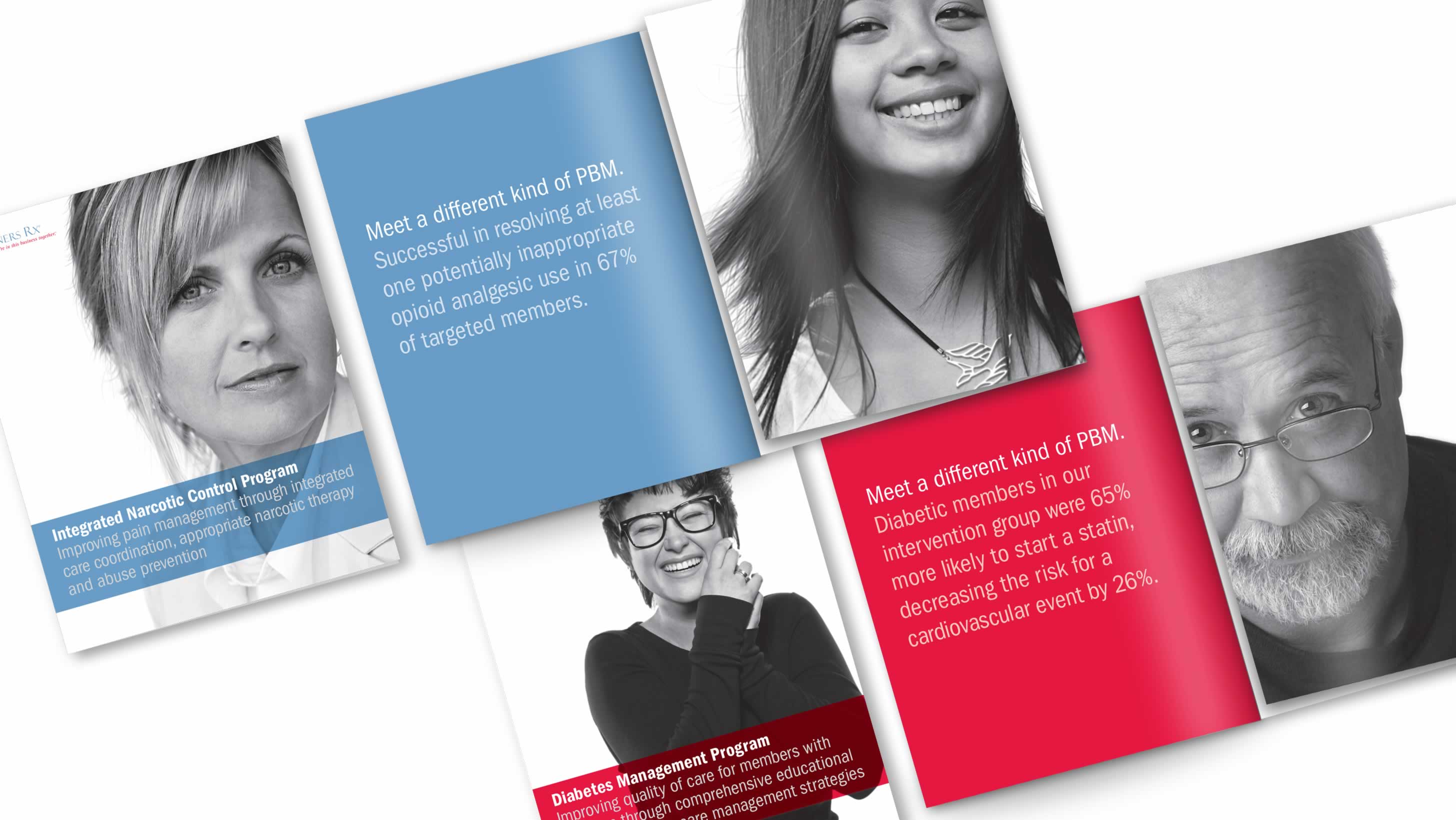
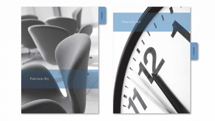
After many years in business, the company’s brand was known only by its logo, lacking any brand visuals. Summation was enlisted to create a strong, identifiable brand look for all print, online and advertising applications, while not changing the logo. The solution featured a series of large portraits to emphasize the company’s focus on people, from patients to providers. The result was well received by customers and helped put a “face” on the brand.
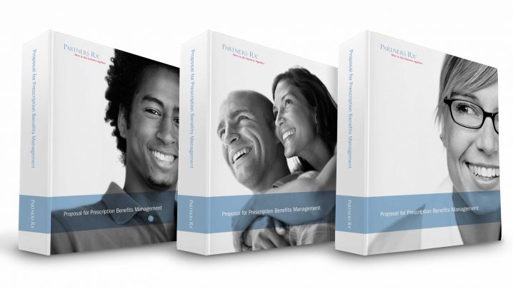

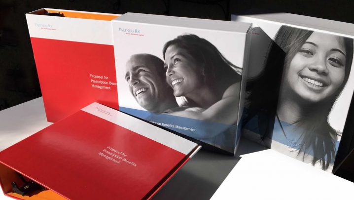
Custom slipcases and binders were designed and fabricated to improve new business proposals. The specific contents could be assembled in-house as needed for each presentation. The use of different portraits on the slipcases added variety to the system.
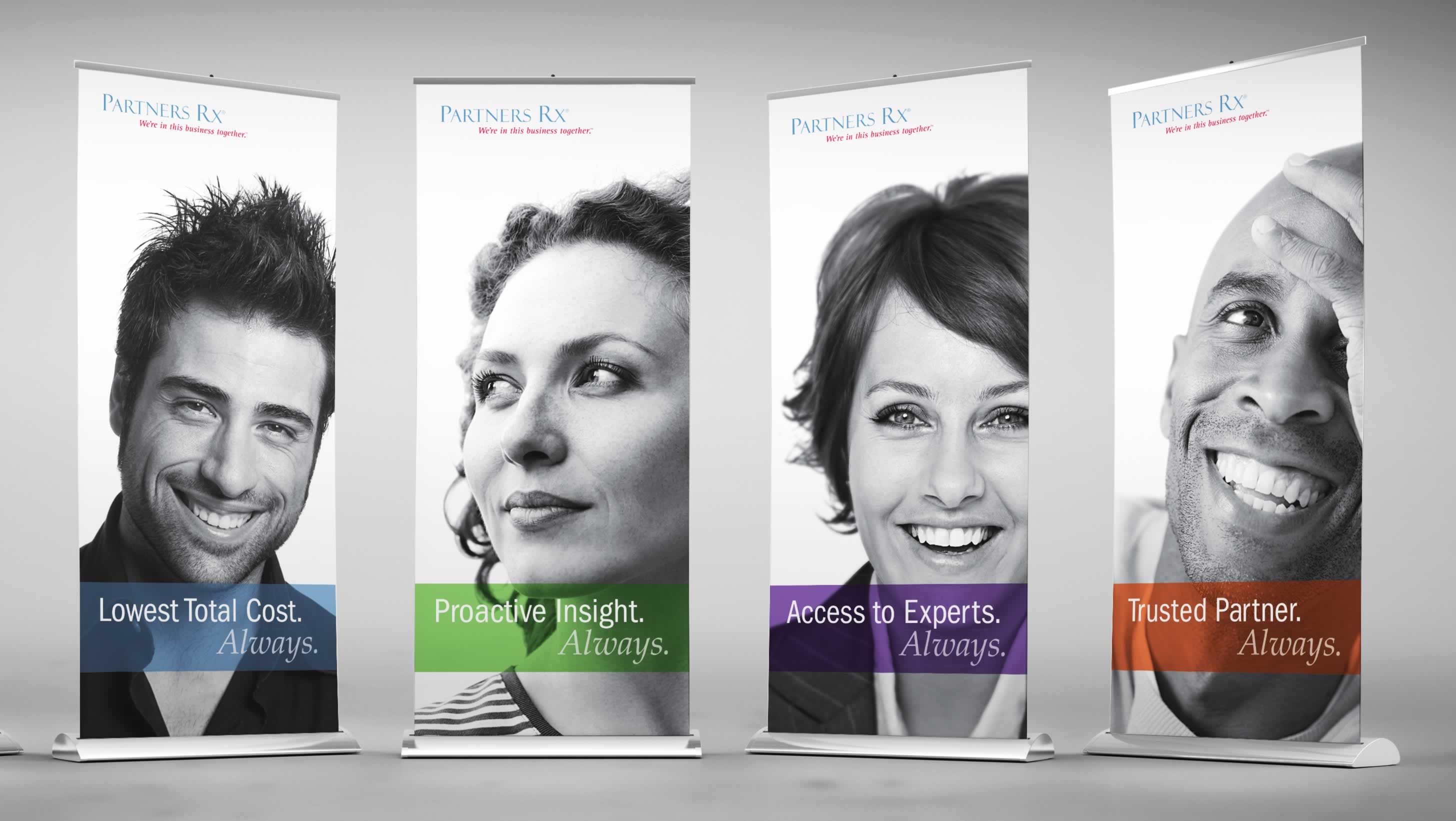
Trade show banners showcased the portraits selected for the brand visual system and reinforced the “focus on people”.

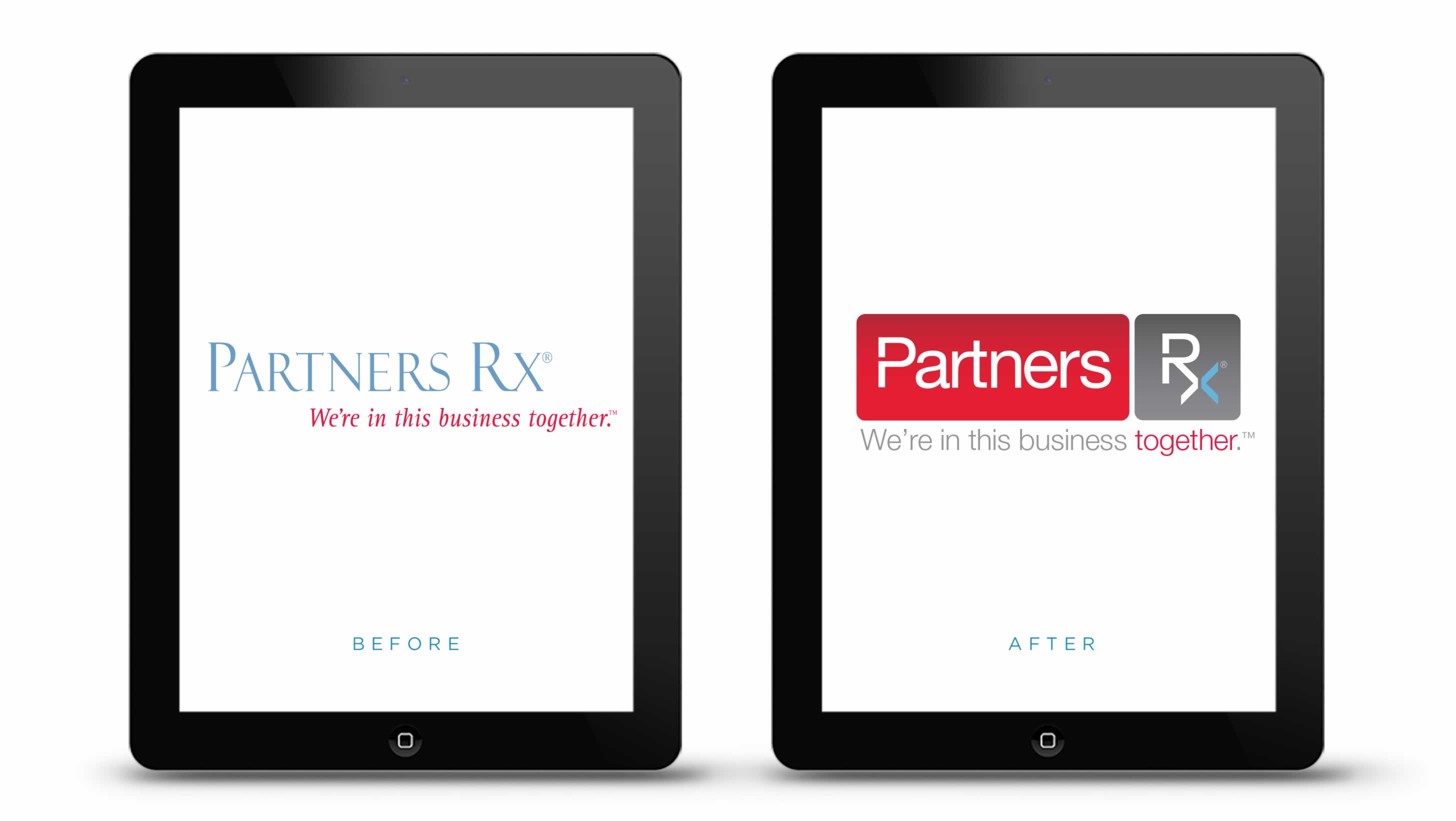
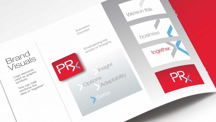
Shortly after the new brand visuals were in use, the company decided to update the logo, requesting an identity with a stronger visual presence.
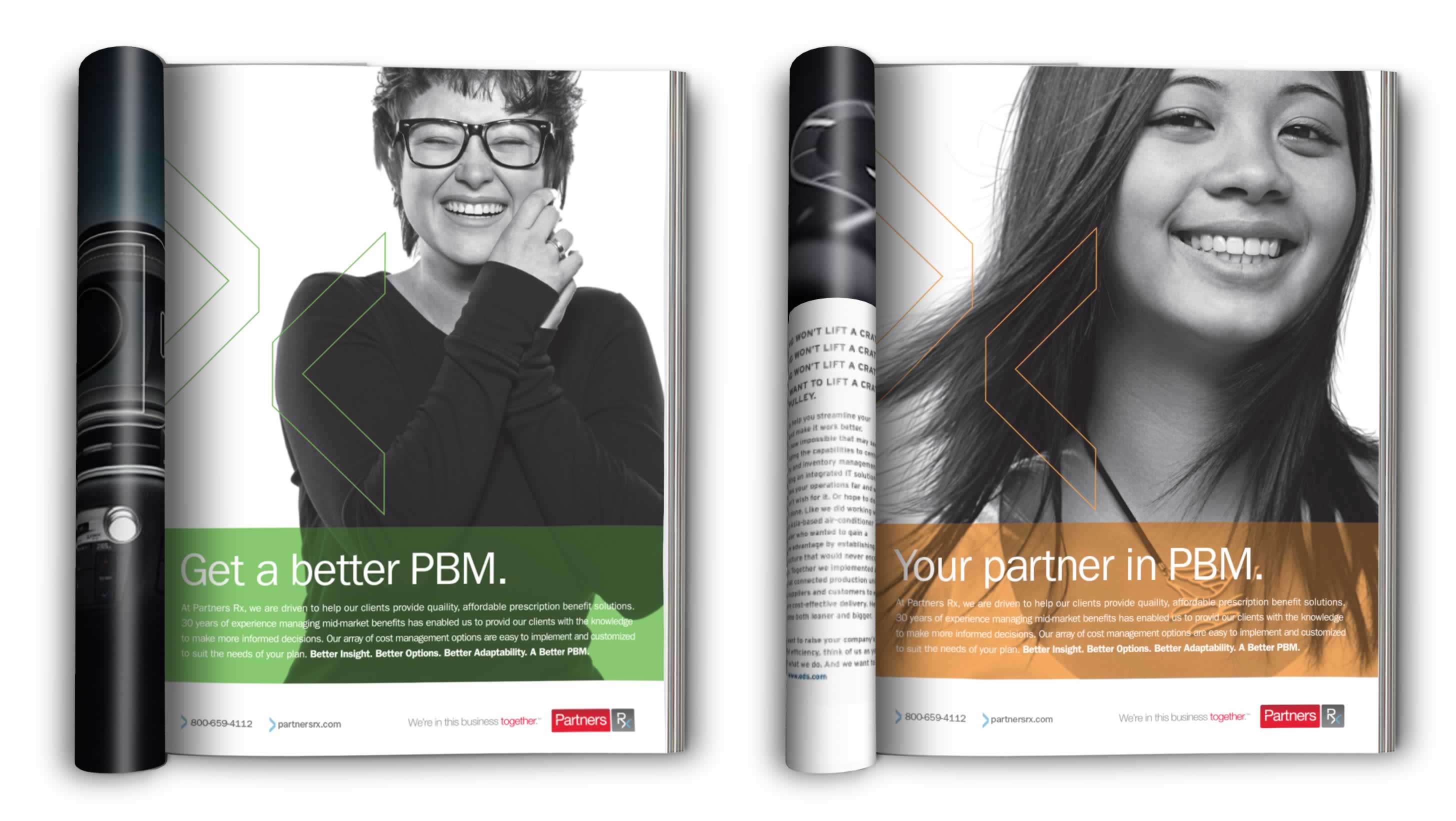
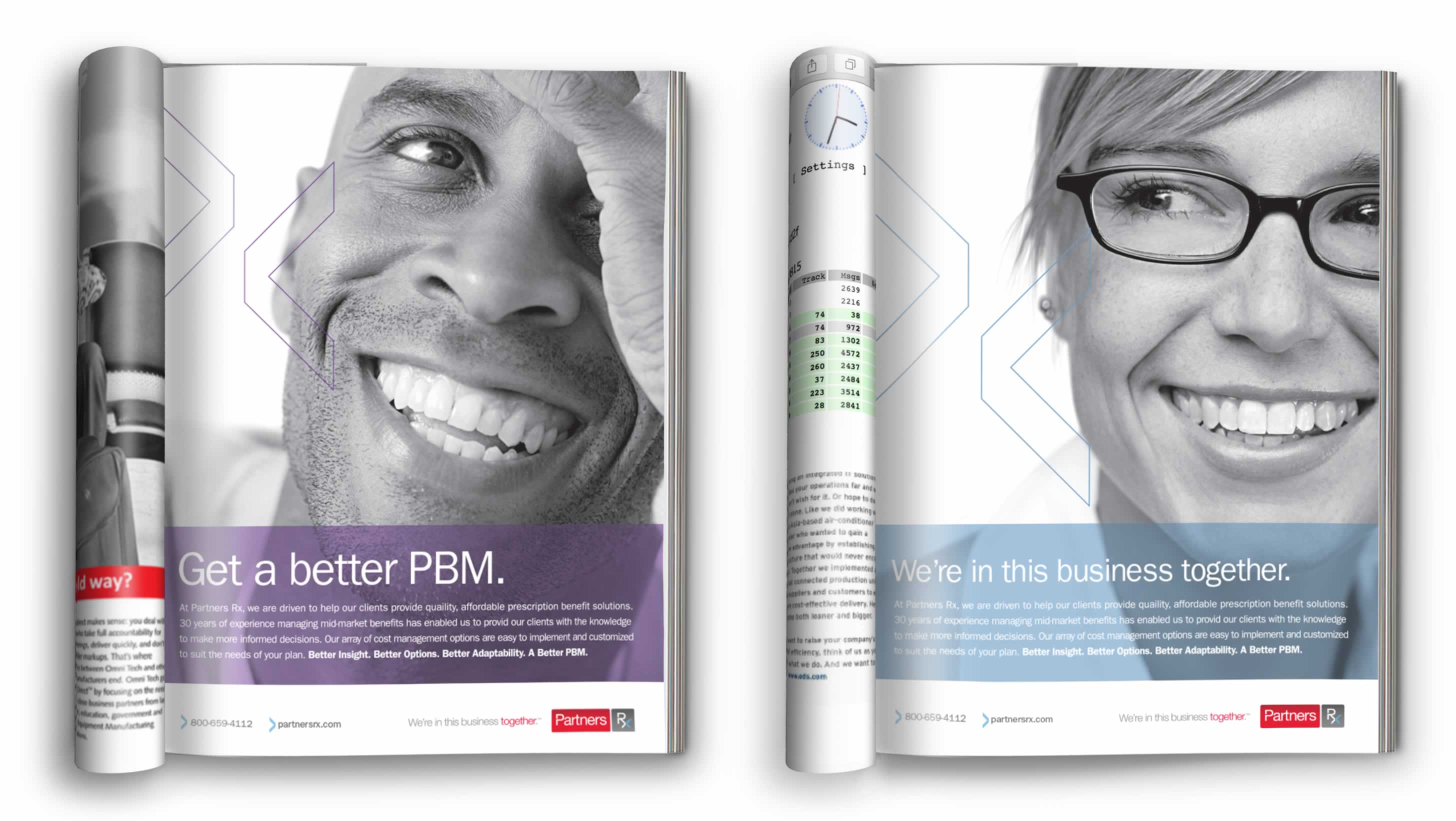
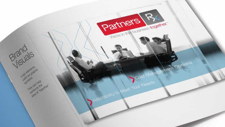
As a prescription benefit manager, this company’s focus is on people—from patients to providers. As part of an overall rebranding, Summation introduced the use of large black and white portraits as the primary visuals. This series allowed for different faces to be used throughout the collateral.
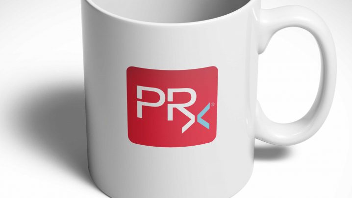
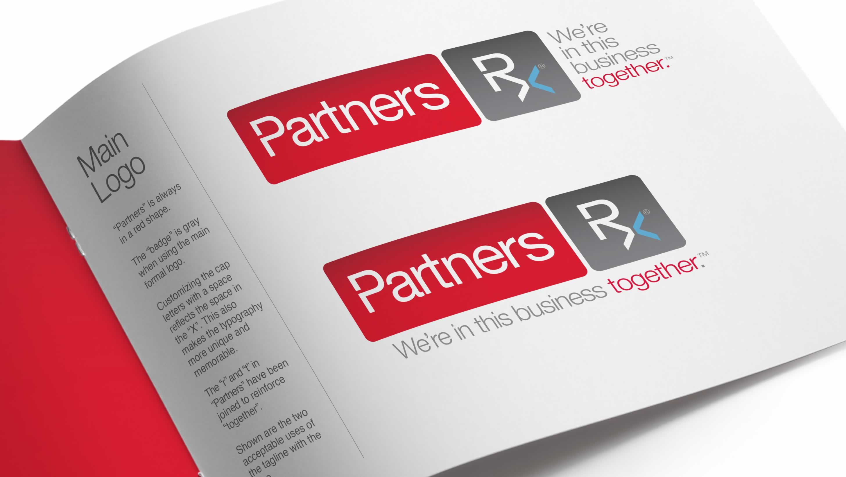
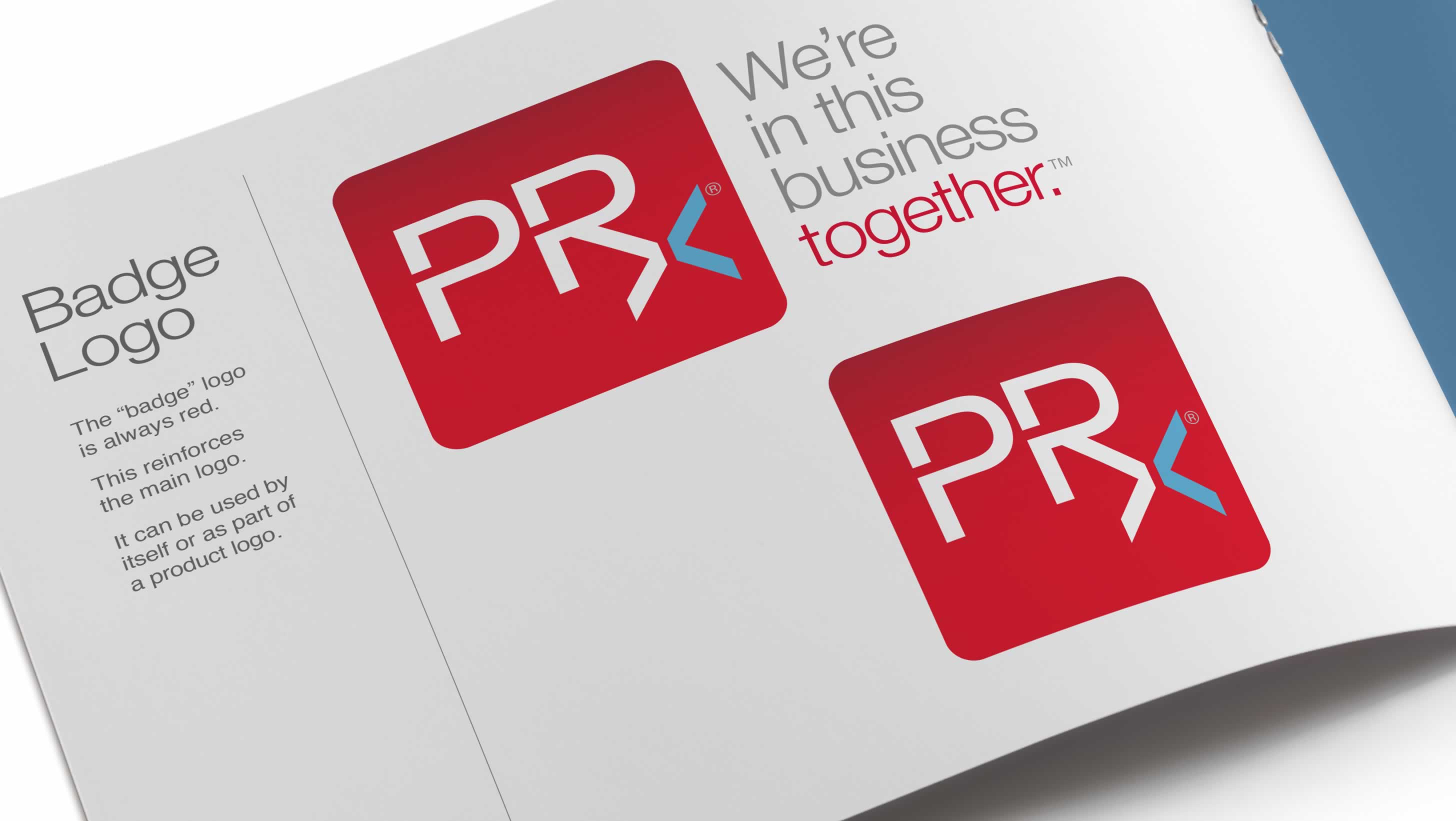
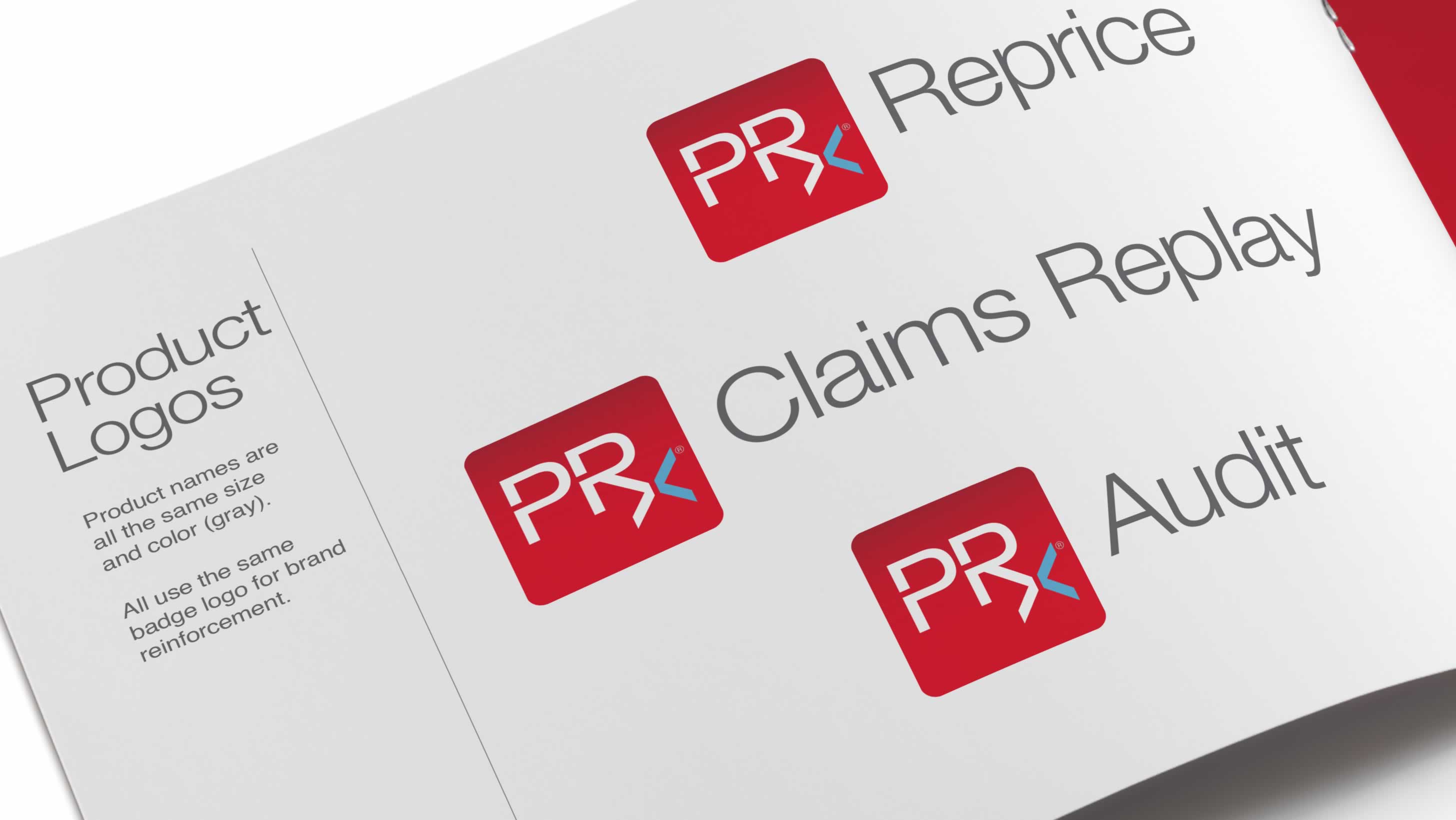
An additional version of the logo was developed for smaller applications. The company was also referred to as PRx.
Following the rebranding of Partners Rx, the company was purchased by Magellan Health.
Related Case Studies
Guidant

Healthcare

Nutrition

Micron