Troxel
Troxel manufactures performance headgear for cycling and equestrian enthusiasts.

Troxel Equestrian
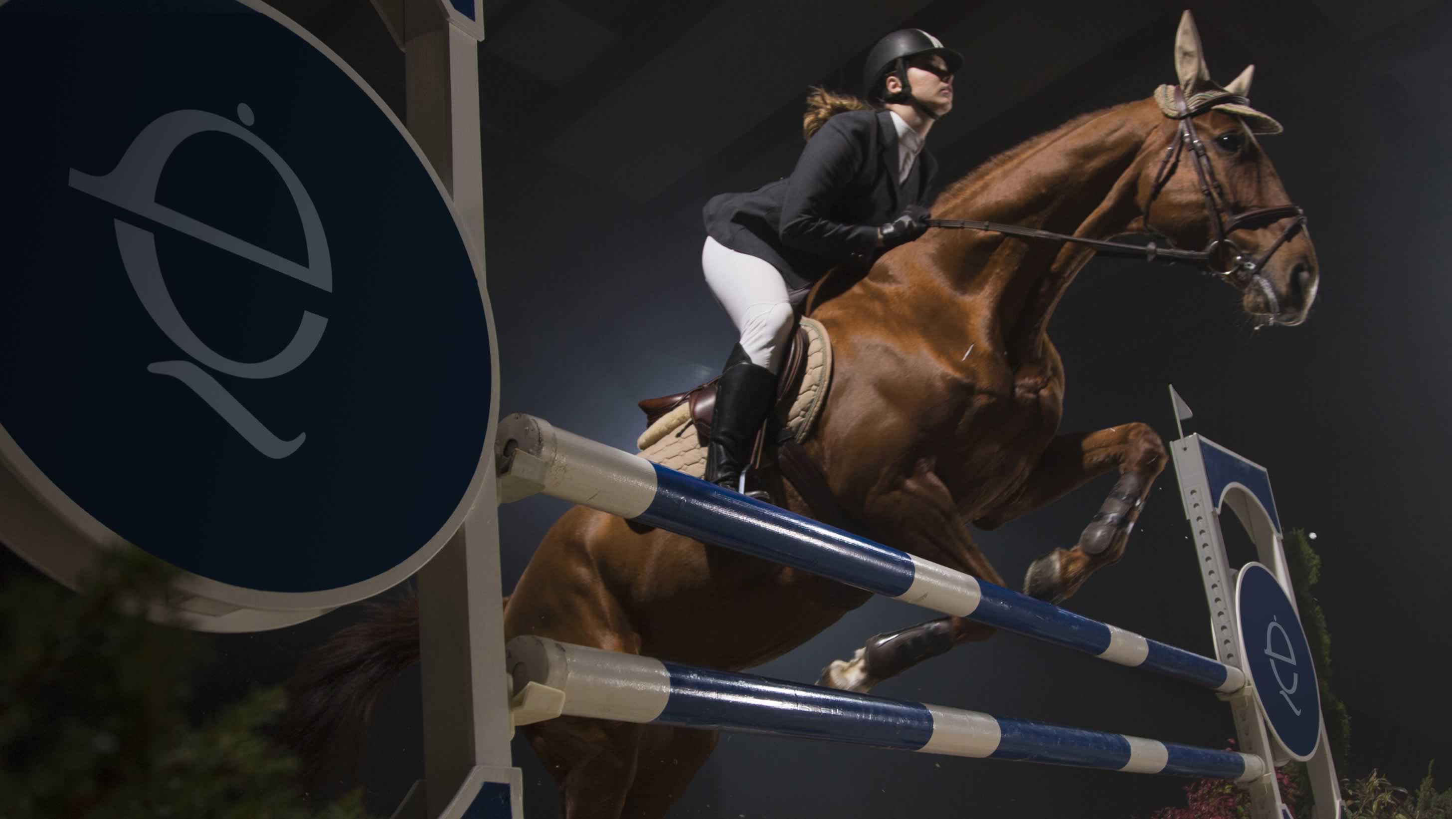
Using the abbreviation for “equestrian”, Troxel’s first riding helmet was named “EQ”. With helmets first designed for schooling, then show, trail, and now specifically for western riders, Troxel continues to create performance headgear for the equestrian athlete.

The EQ logo elegantly combines the two letters to form the head and helmet of an equestrian rider.
The Troxel wordmark contains the EQ logo within the name.

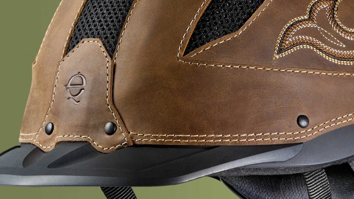

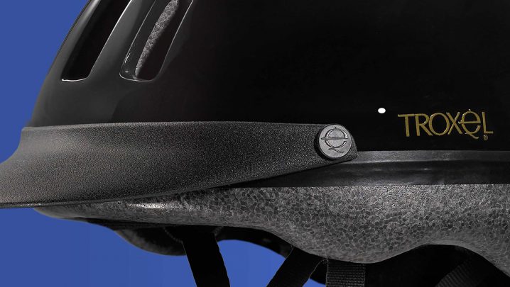
Troxel’s equestrian helmets were branded with either the EQ symbol or the Troxel wordmark.

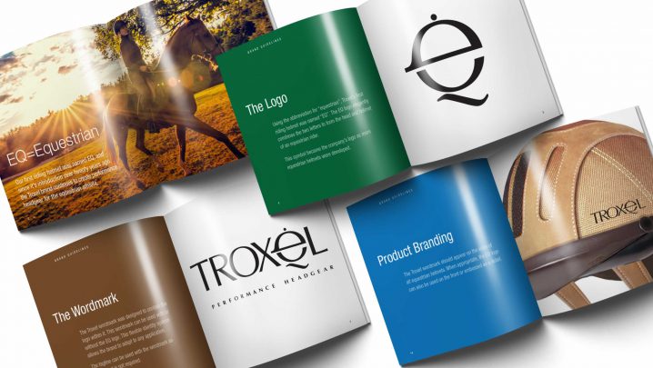
Brand guidelines reinforced the simplicity and flexibility of the identity.
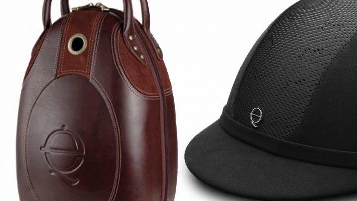
Product branding utilized the logo in various ways.

Troxel Cycling

Troxel was established in 1898 as a manufacturer of cycling components, and evolved as a leader in cycling and equestrian helmet technology.

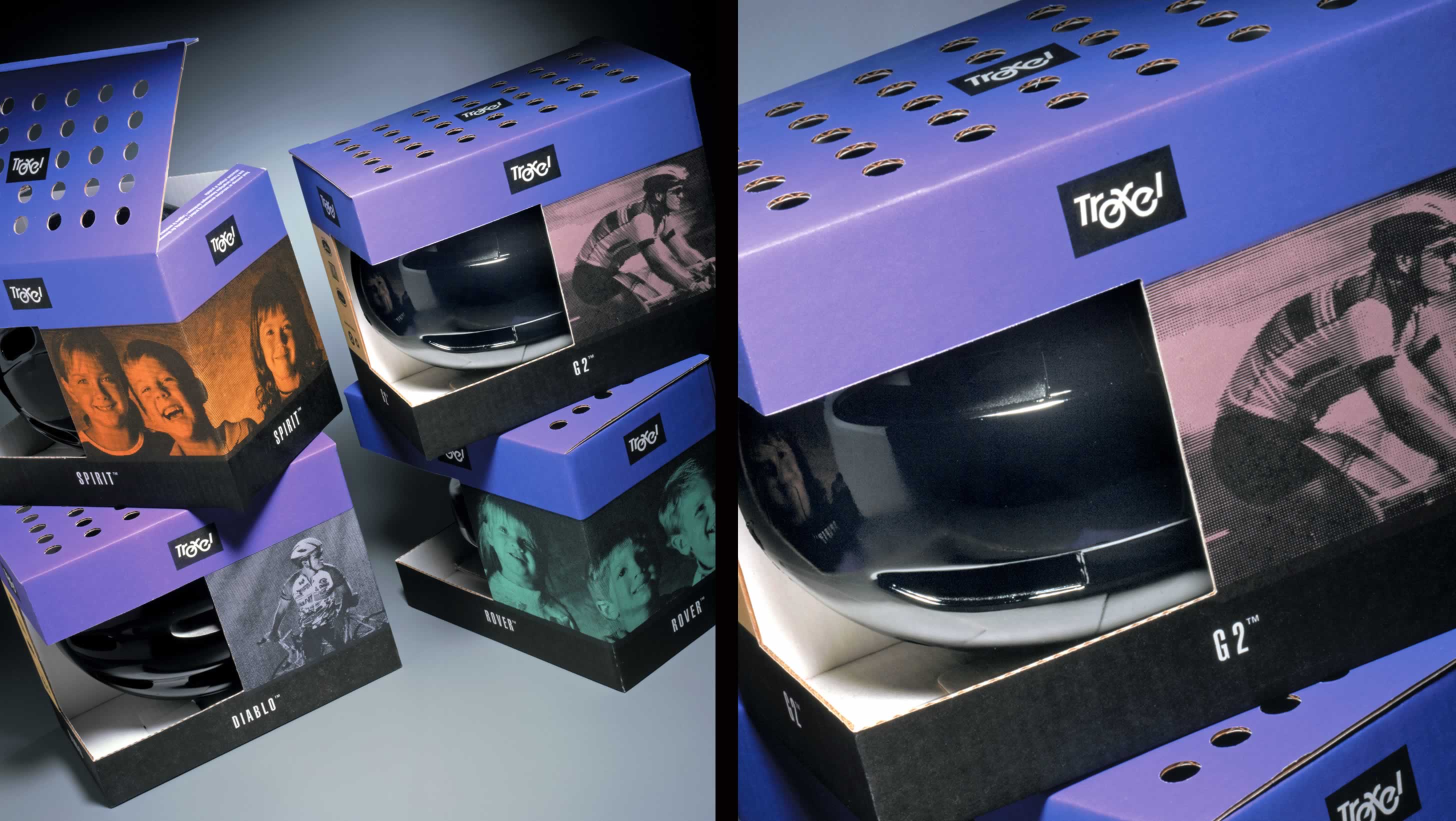
Troxel wanted an eco-friendly package with a distinct design that would unify the various helmets within their brand. This solution used soy-based inks and flexographic printing directly on the recycled corrugate to eliminate any laminating. A system of bright colors distinguished the models. For a unique look, the box tops utilized die-cut holes to mimic helmet air vents. This also allowed the helmet color and pattern to be more visible.

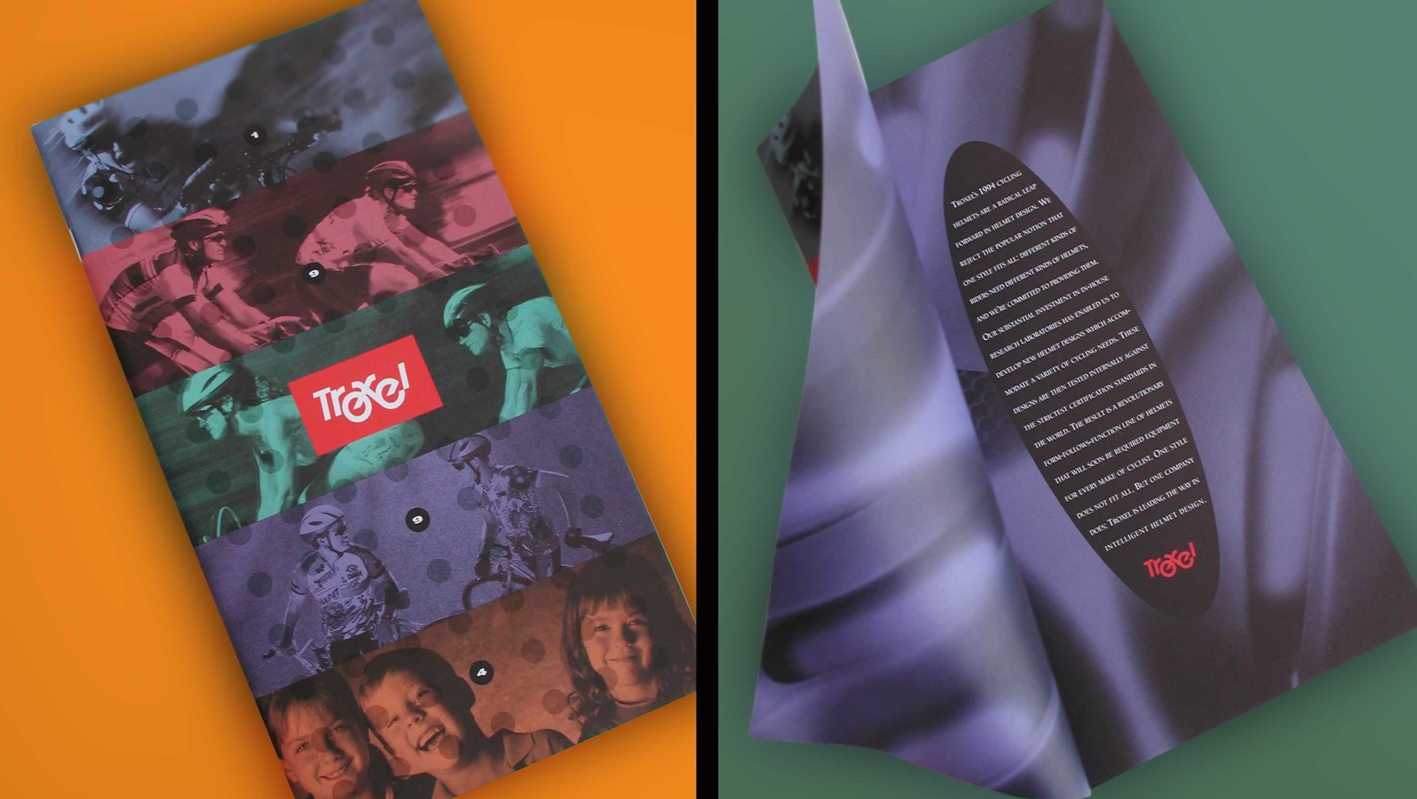
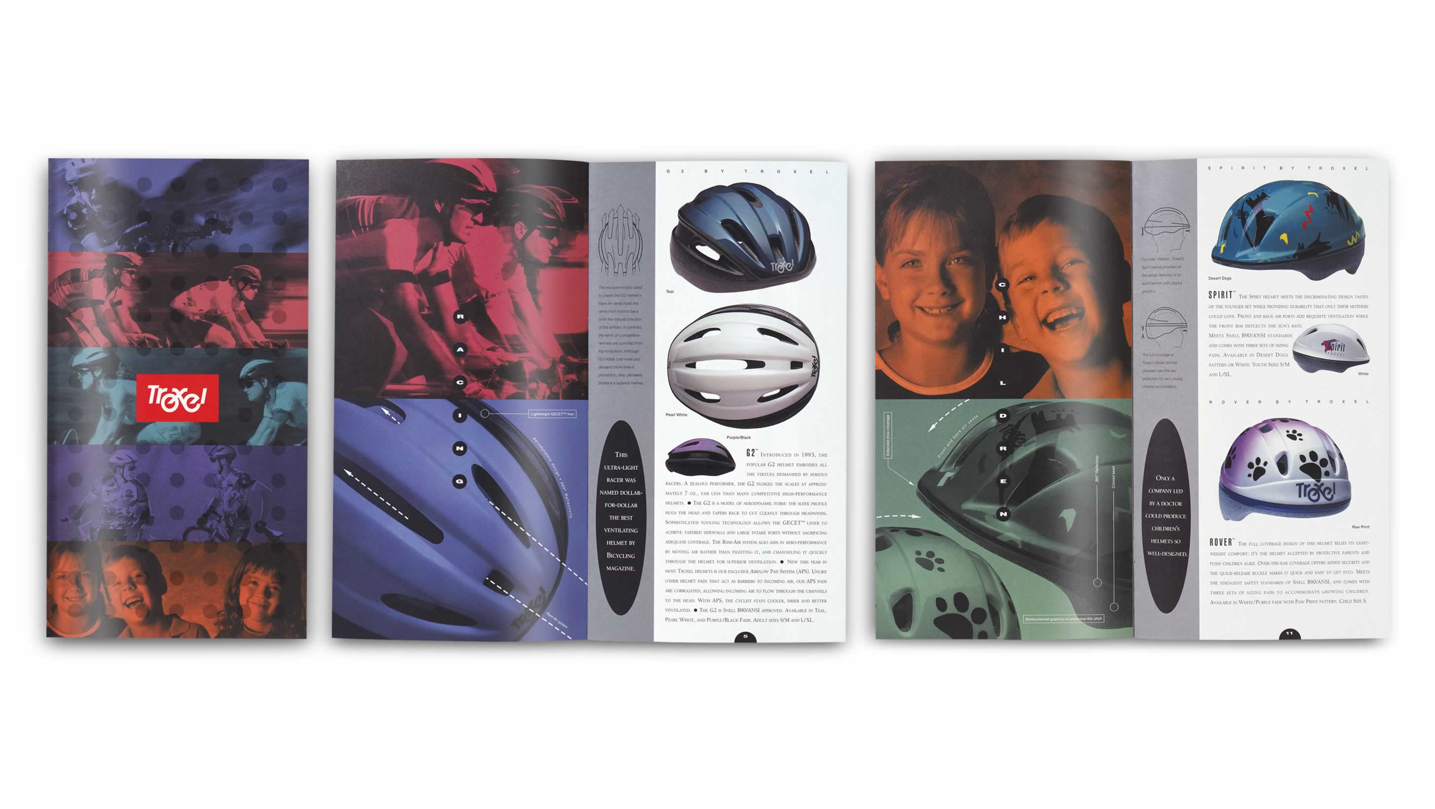
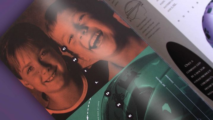
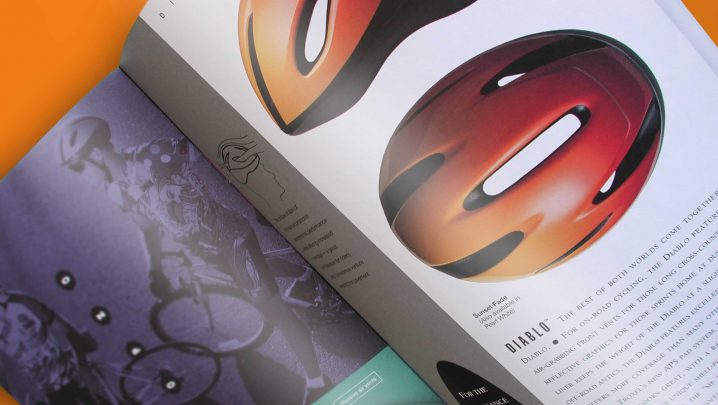
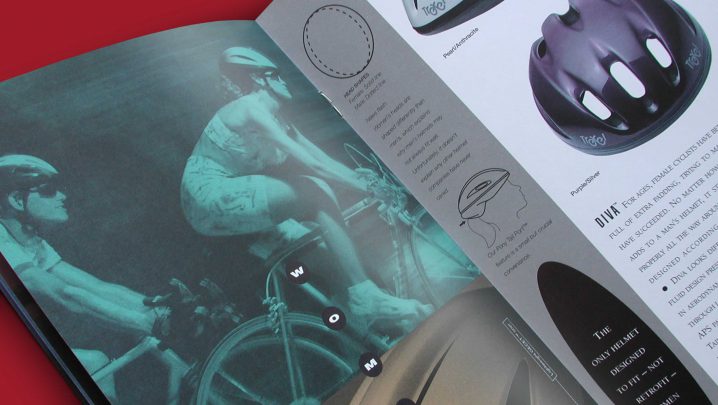
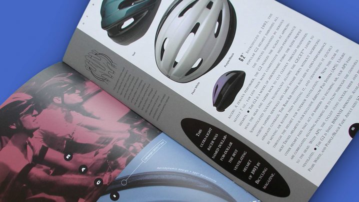
This dealer brochure included the entire Troxel helmet line, and explained each helmet’s features and benefits. It was designed with the helmet packaging to create a stronger brand.


