Knight Transportation
Knight Transportation (NYSE: KNX) ranks among the largest full-truckload carriers in the United States, with a fleet of over 3,500 company-owned tractors and 36 regional service facilities coast to coast.
Client: DocuPrint Solutions


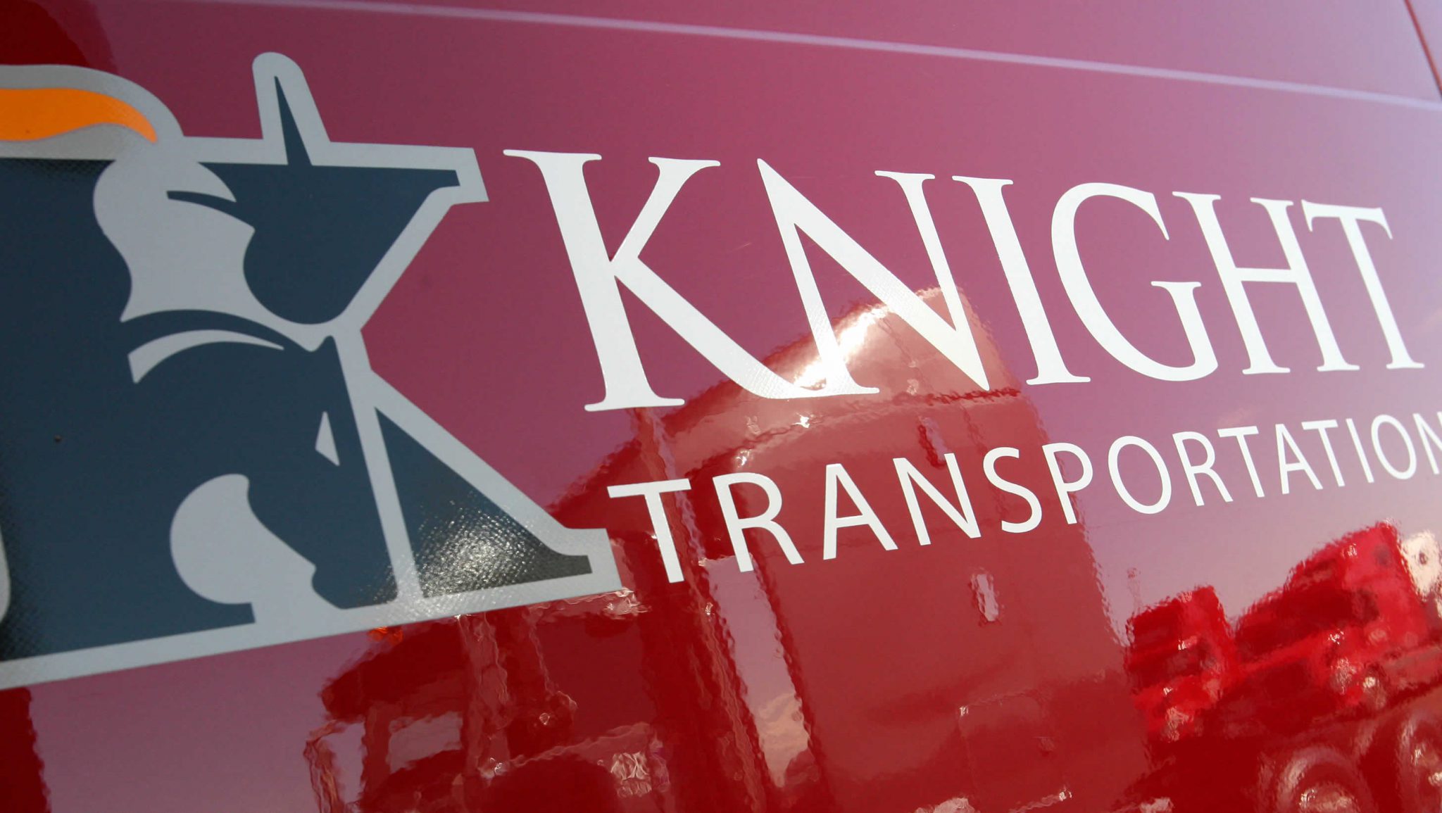
The new logo leveraged the established brand equity of the letter “K” and the color red. The image of the knight was simplified and integrated into the letterform.
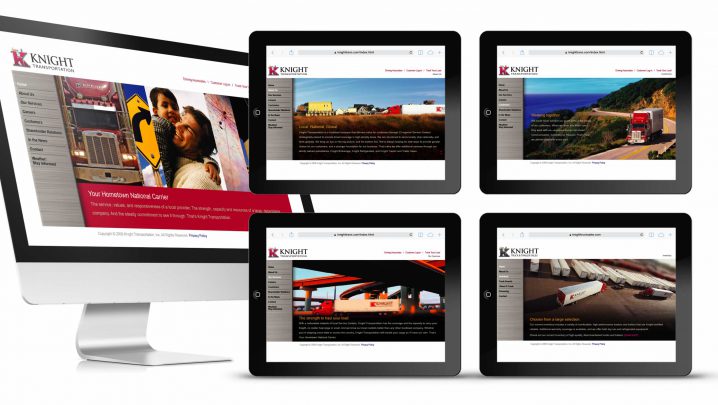
Interactive projects ranged from a new website to the company intranet, which enhanced employee communications and became a valuable resource for truck drivers on the road.
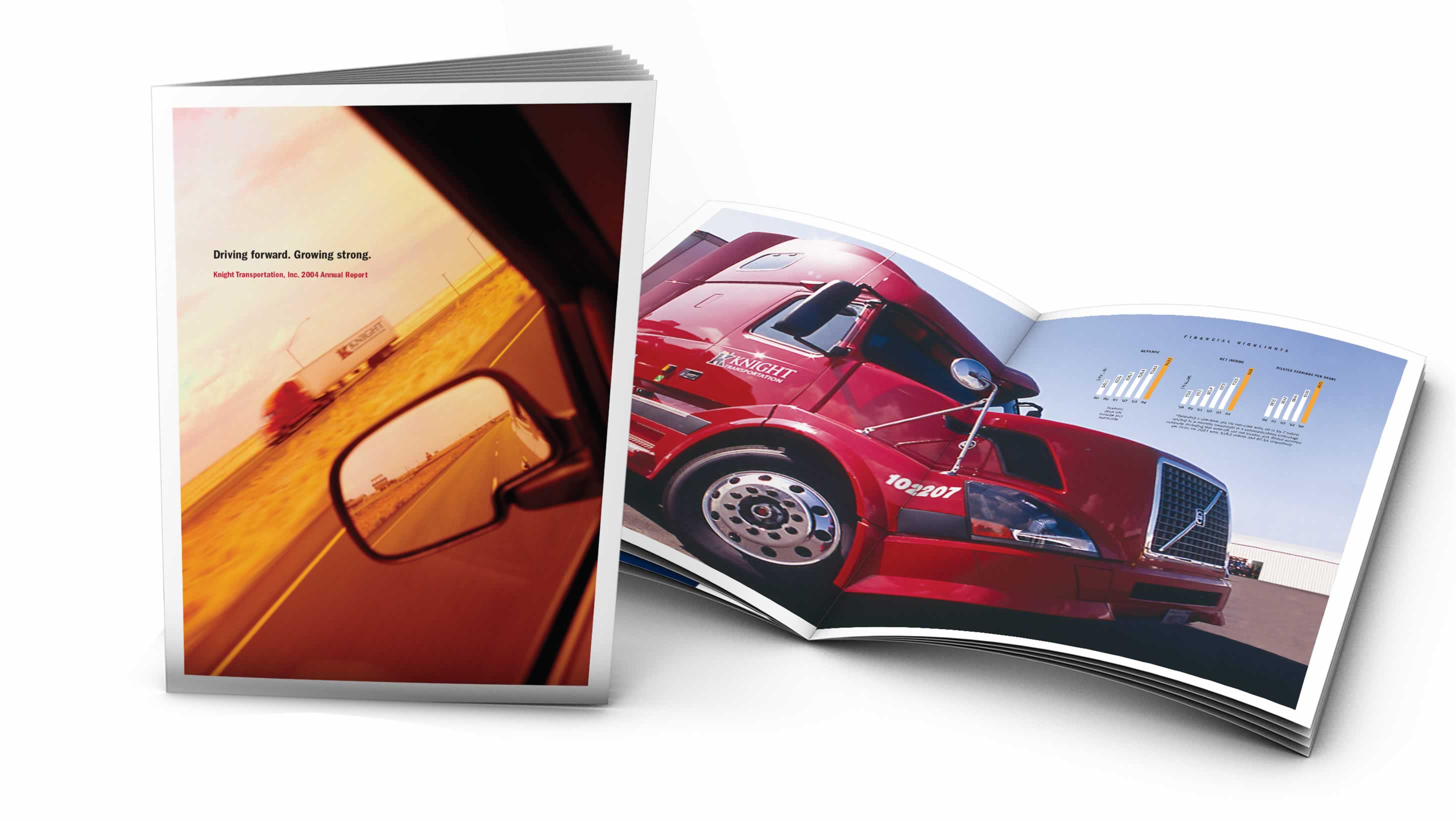
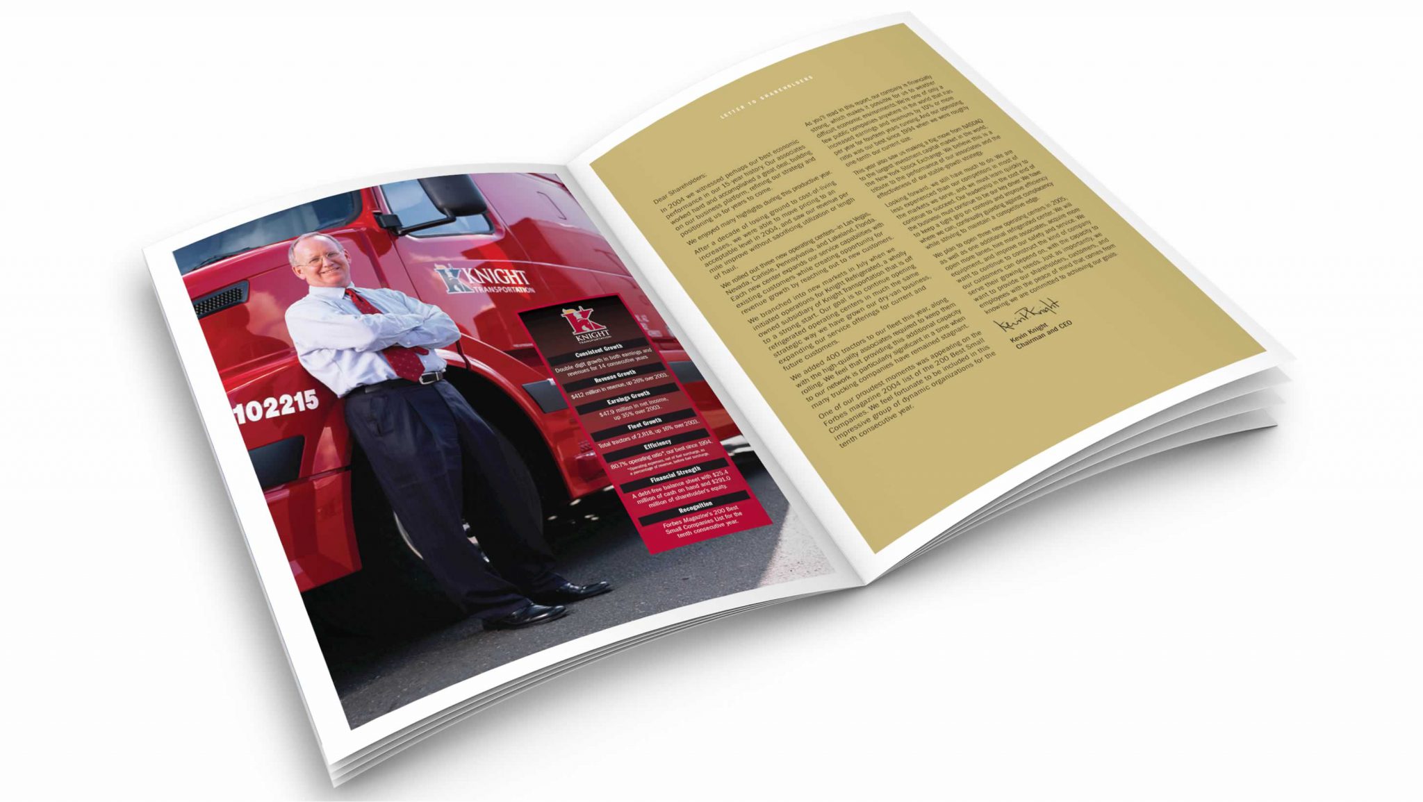
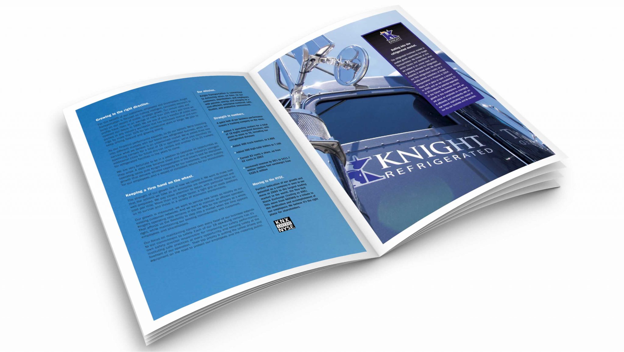
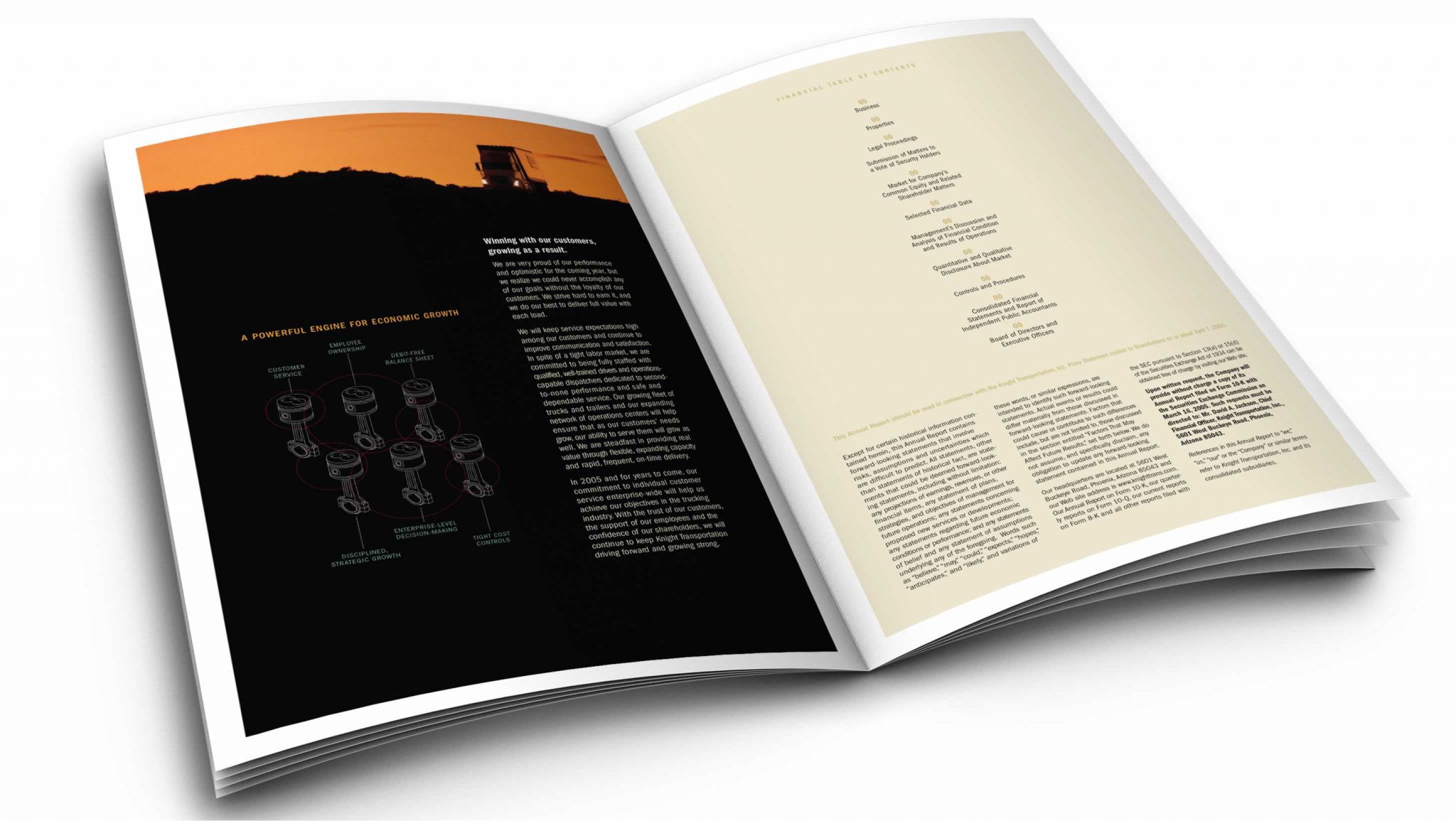
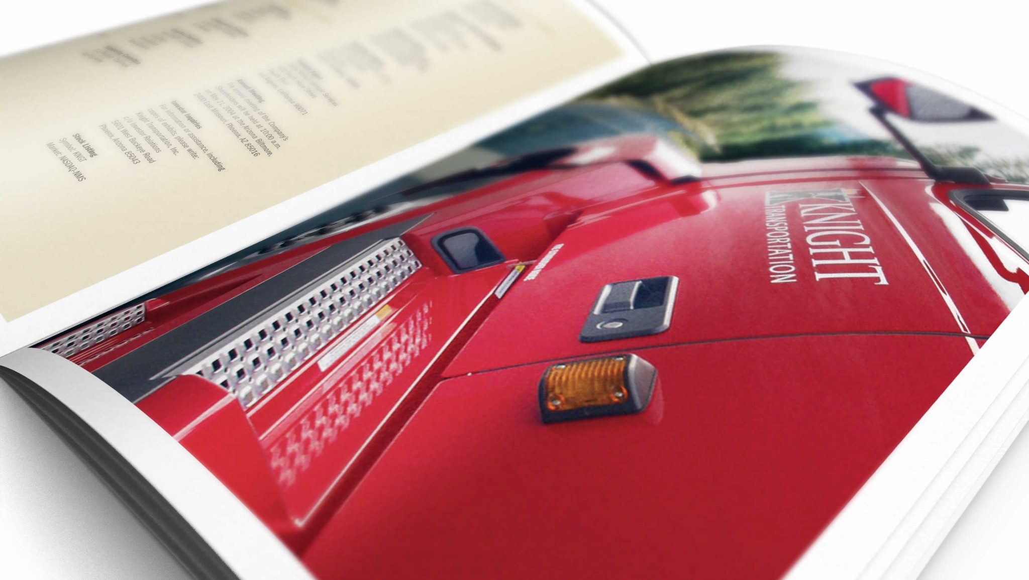
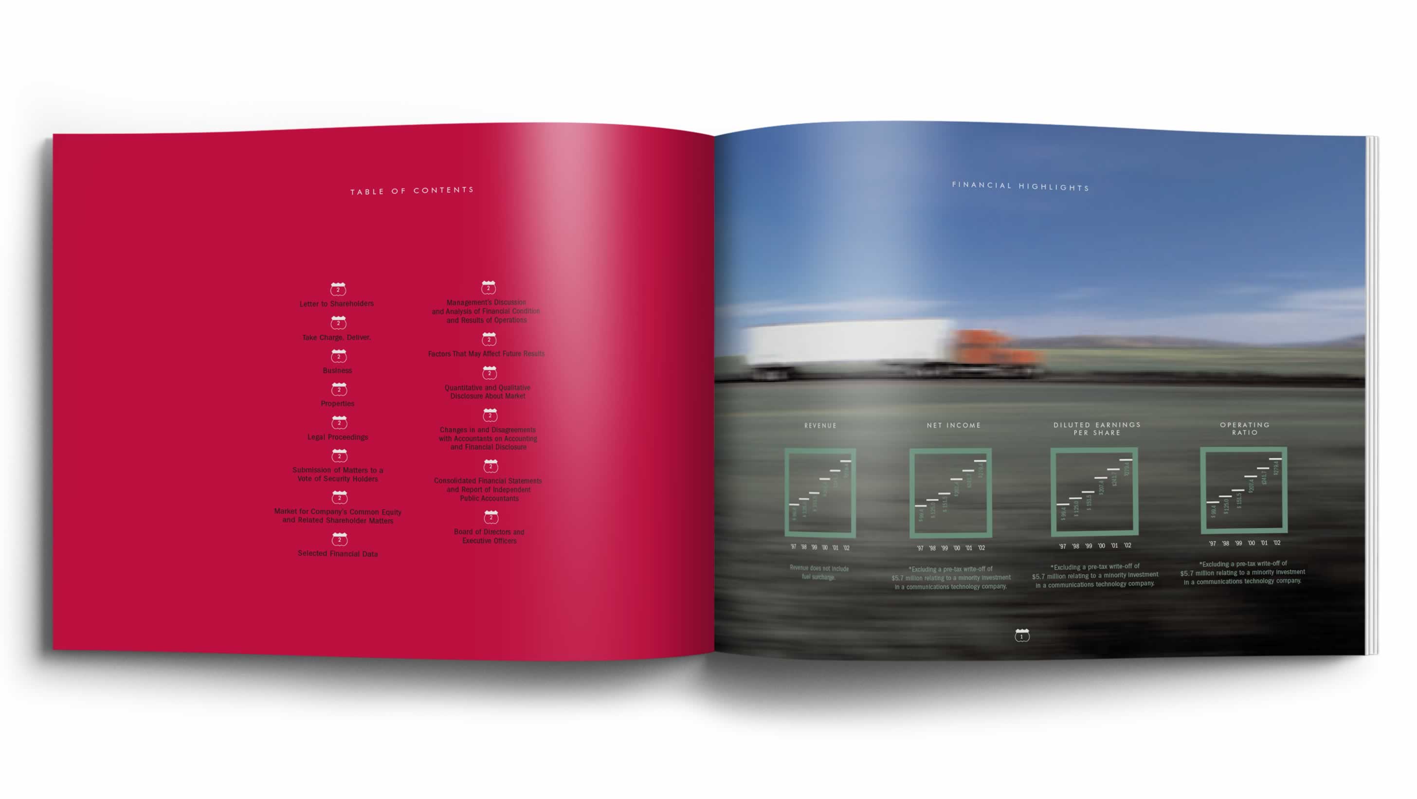
This annual report’s theme focused on business growth. Featuring financial highlights and strong, bold imagery, it also debuted the newly-developed Knight Transportation logo.
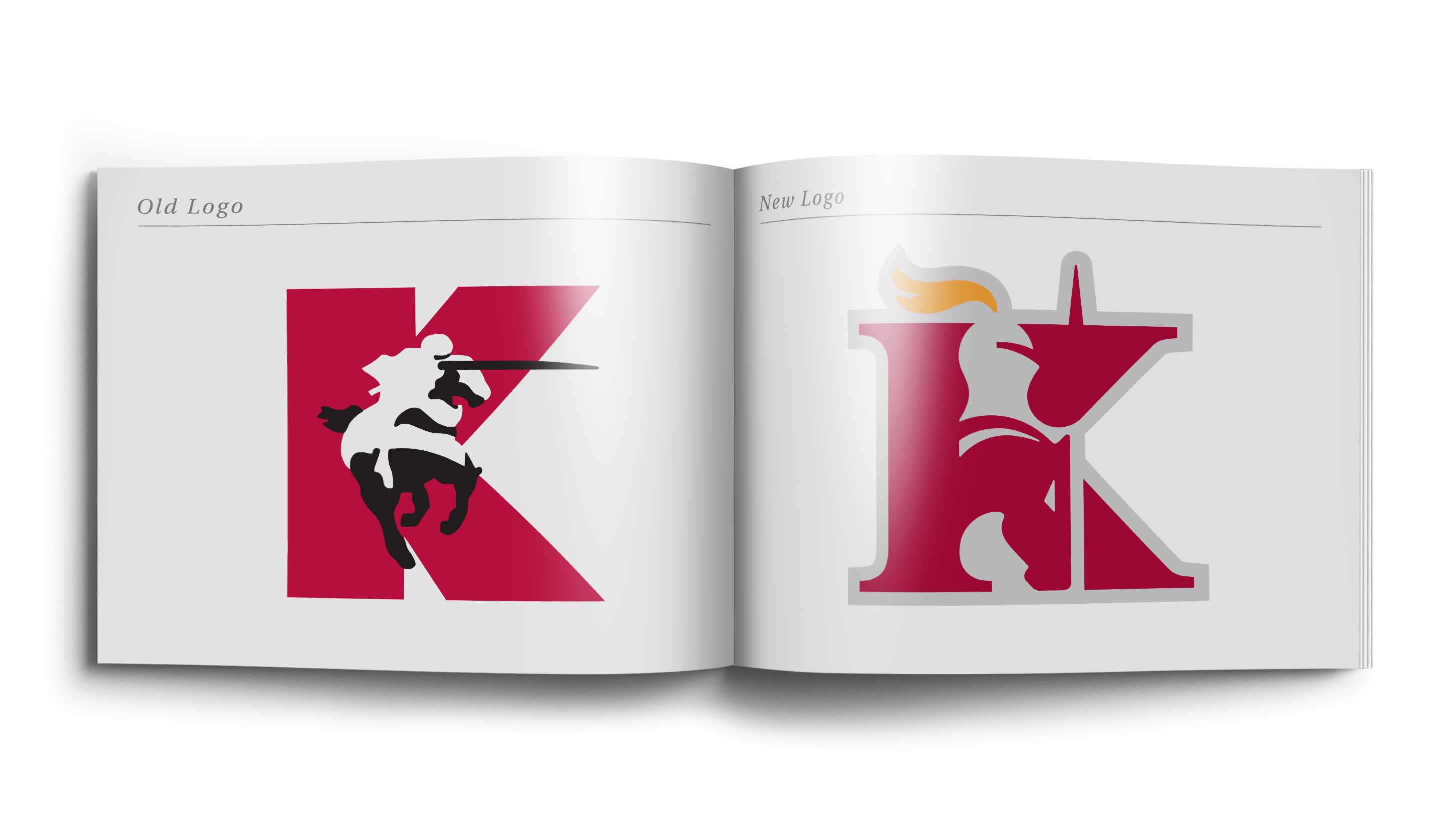
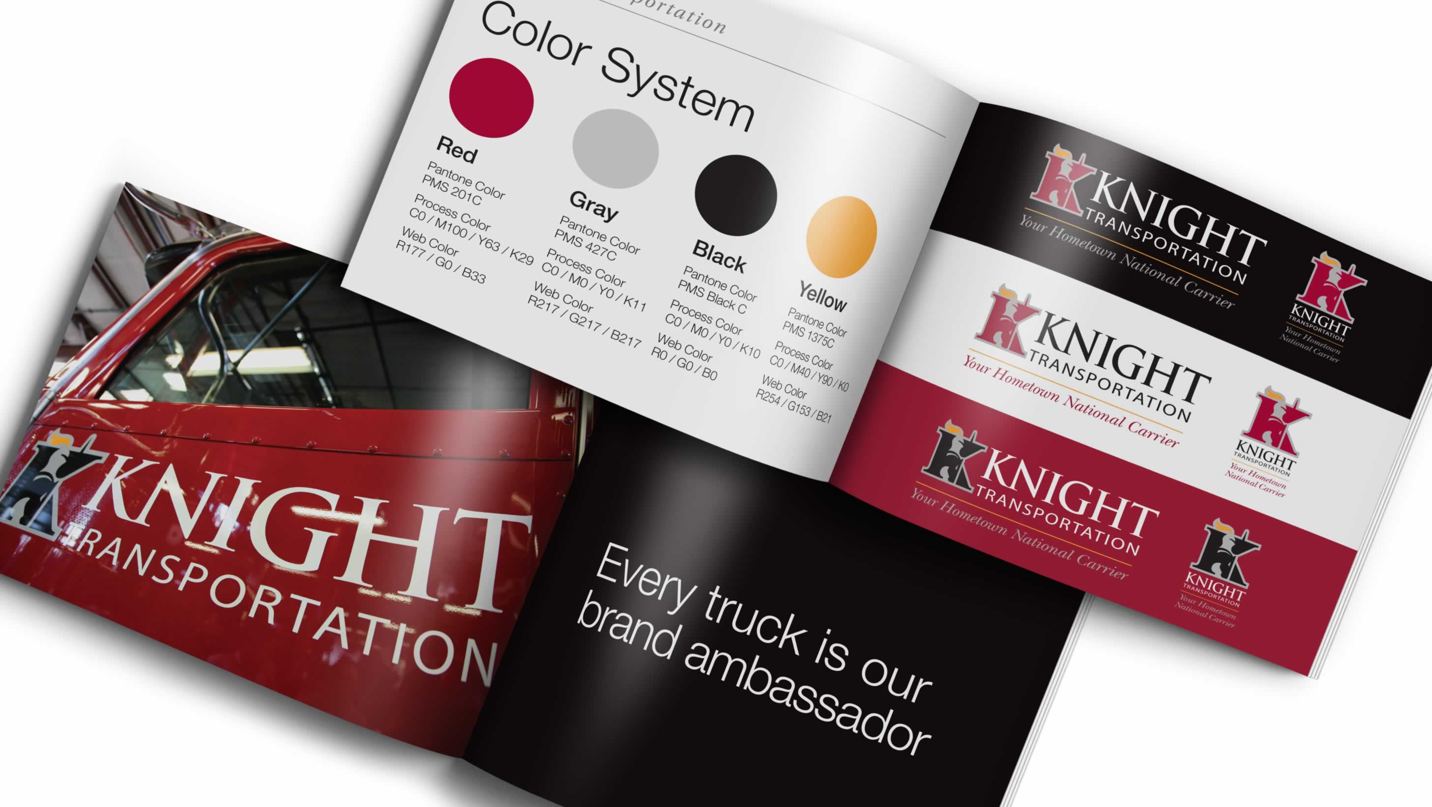
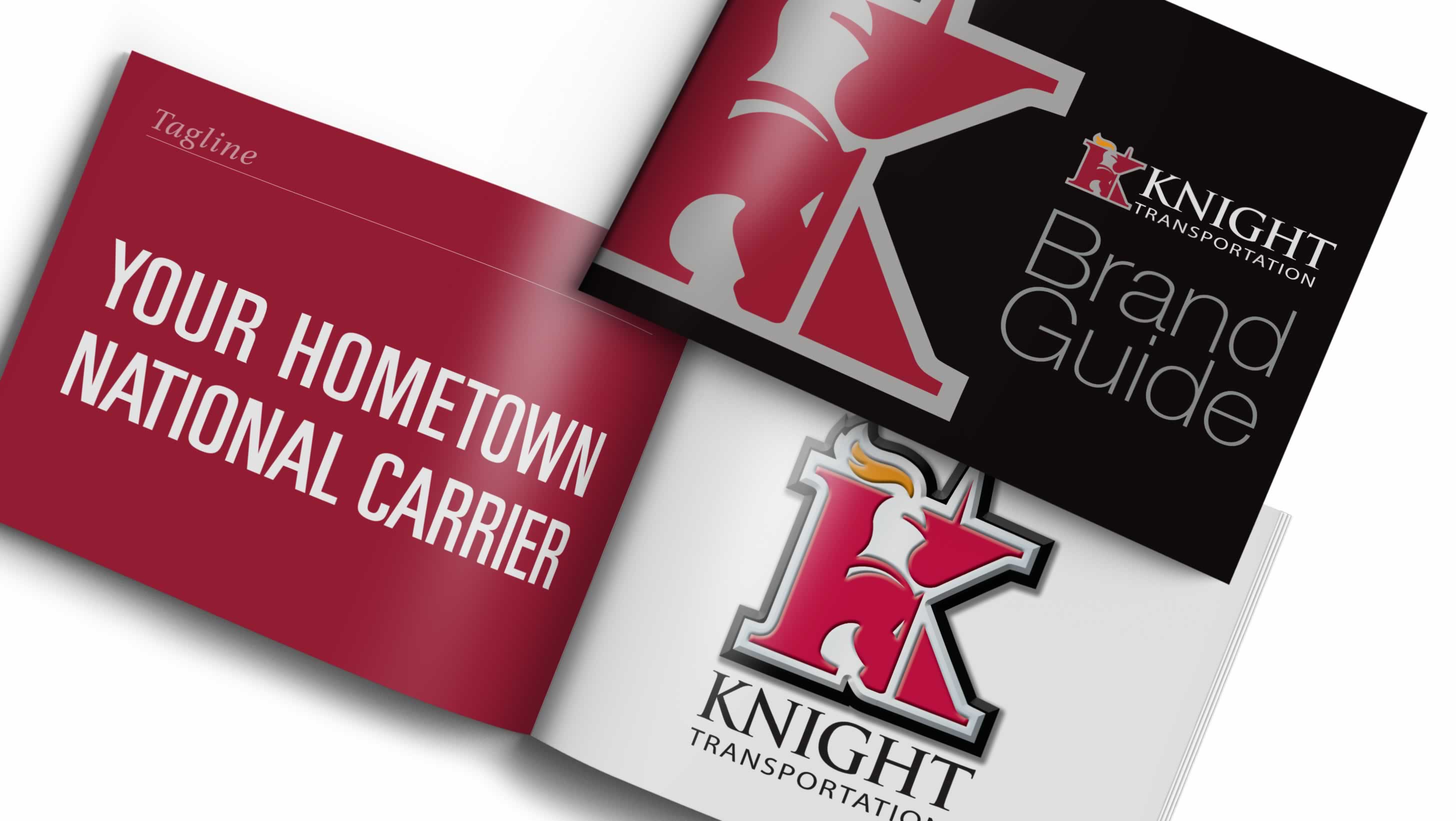
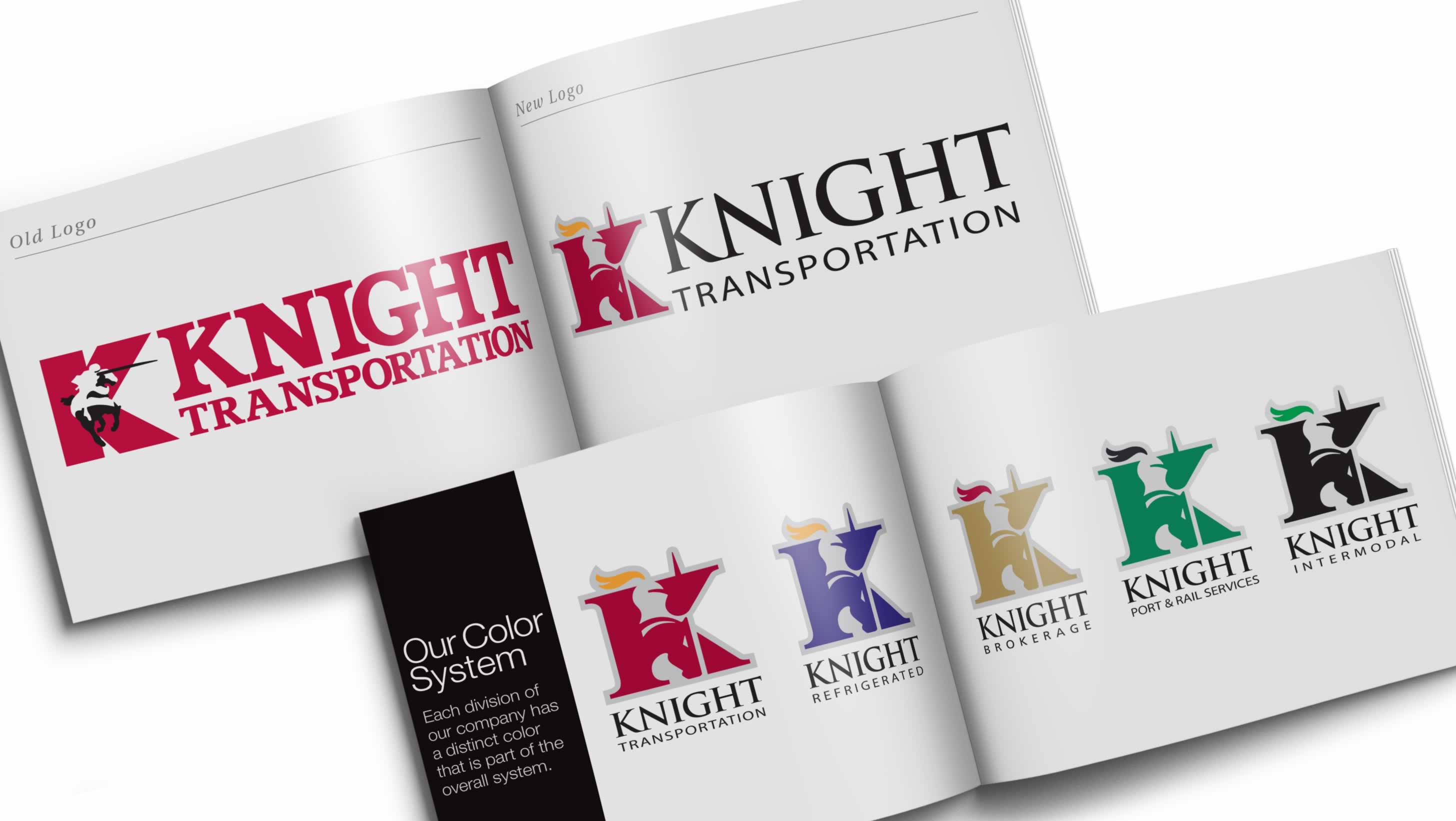
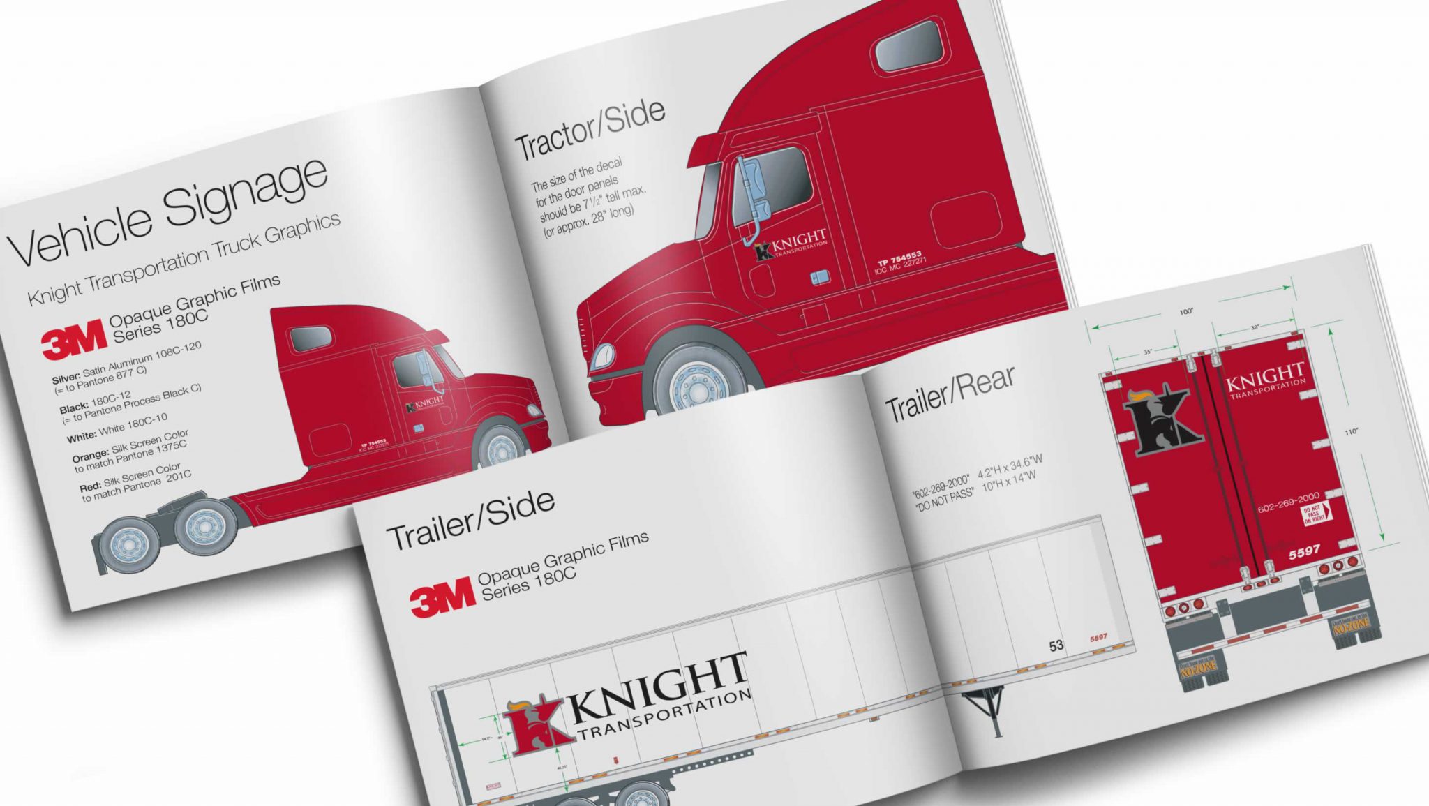
Summation developed a brand guide for Knight Transportation establishing proper usage for the logo, including a color system and vehicle signage application.
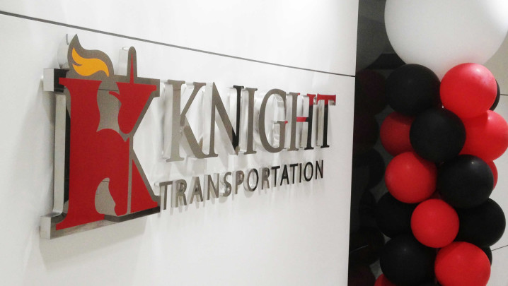
The new logo is showcased in the lobby of the corporate office.
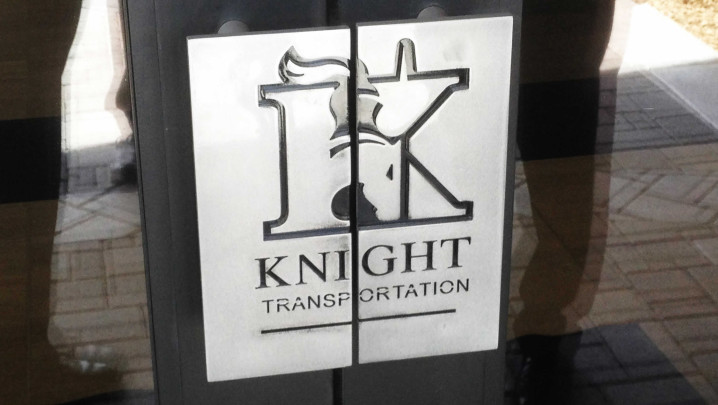
Custom-fabricated steel door handles at the corporate offices feature the new logo design.
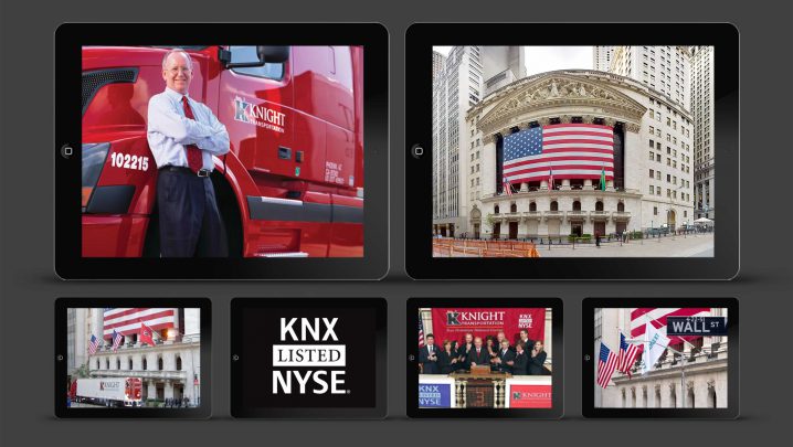
The rebranding initiative culminated with a listing on the NYSE, with the celebration including driving a new truck down Wall Street to ring the bell.
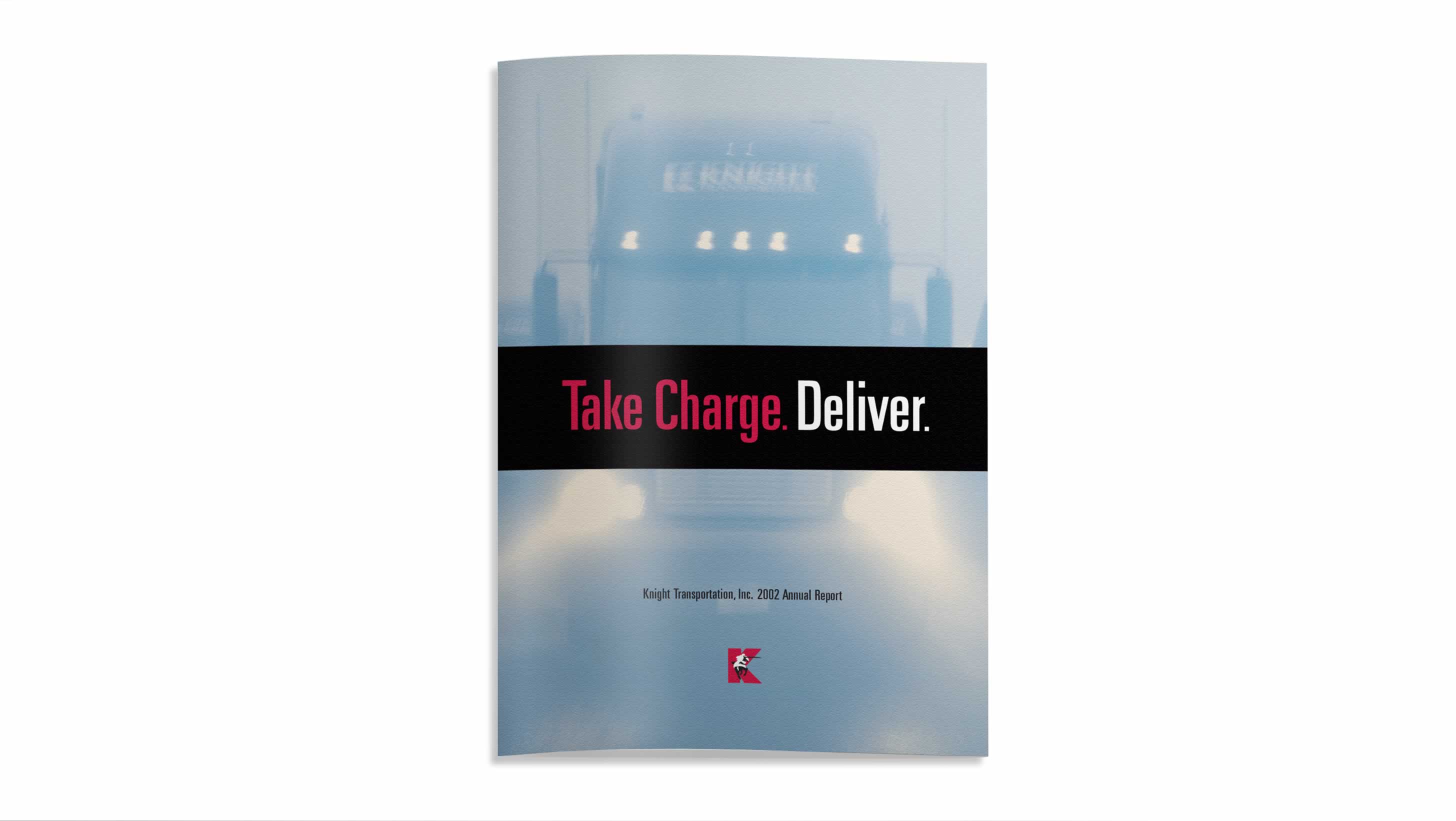
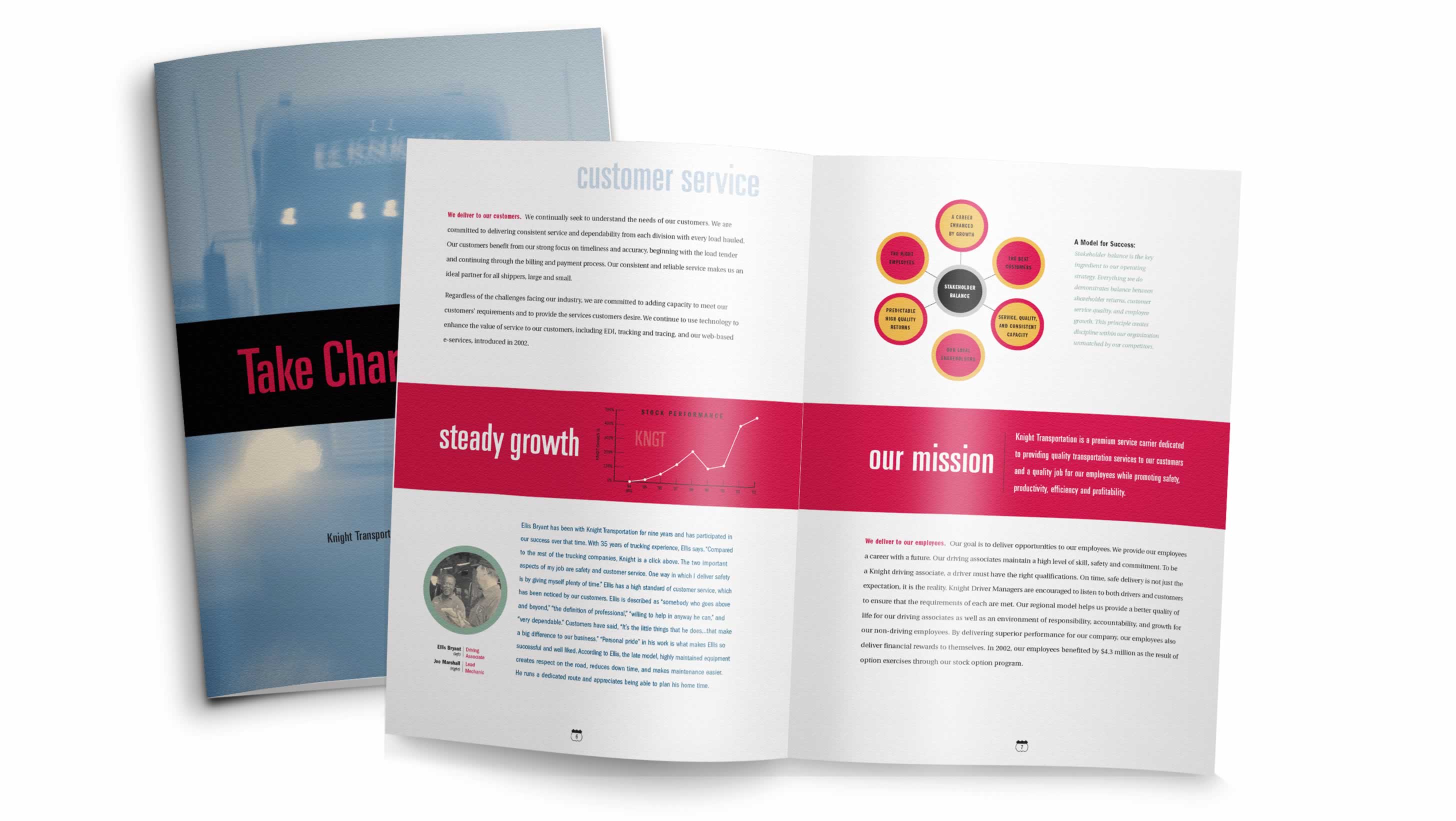
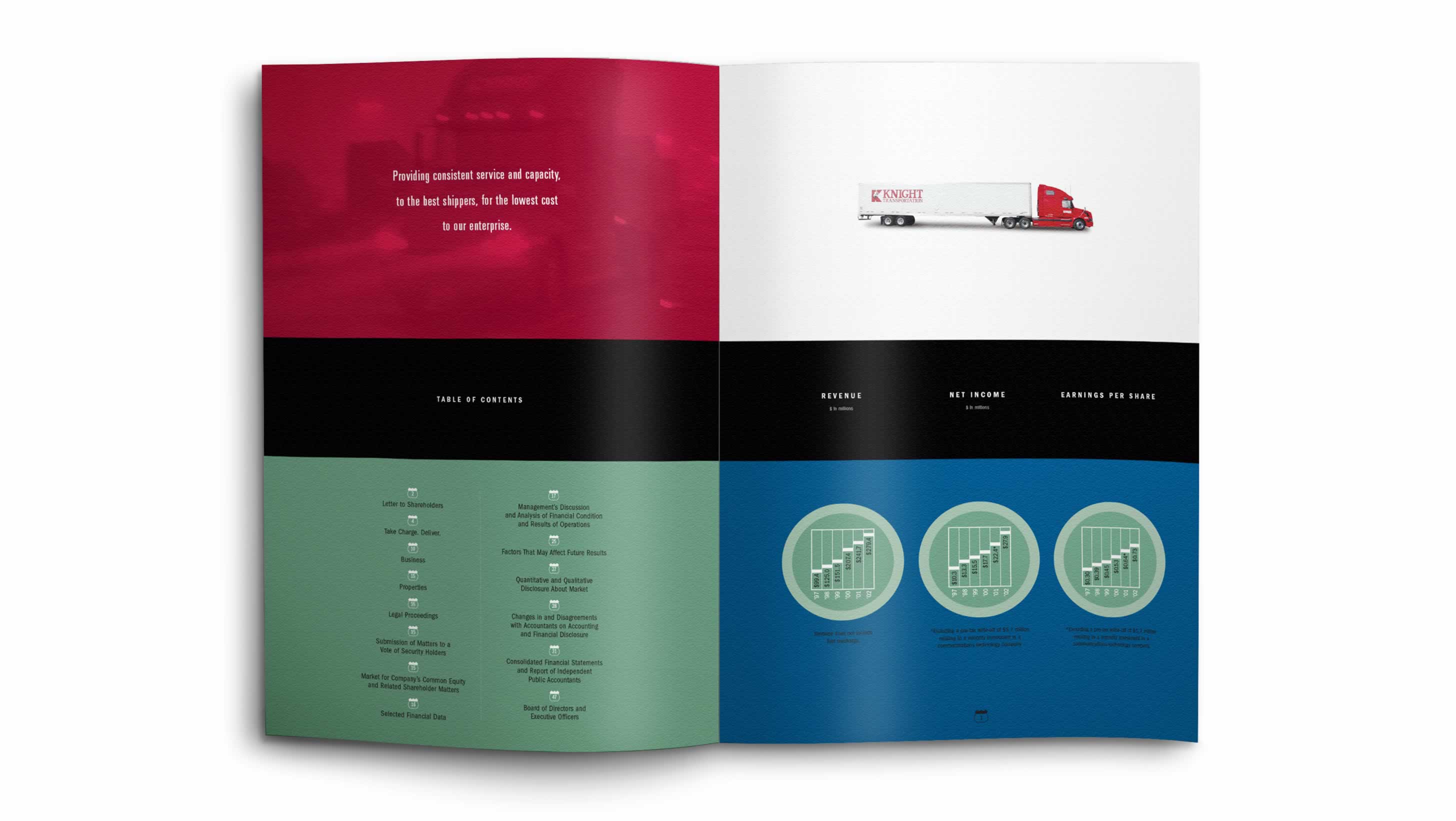
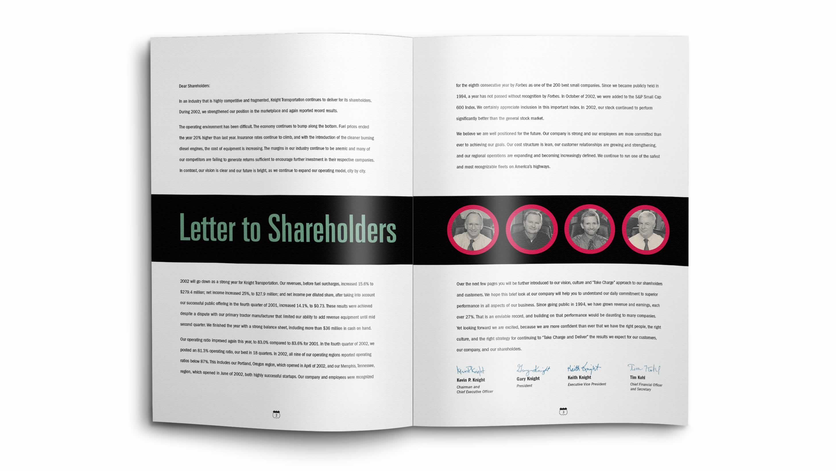
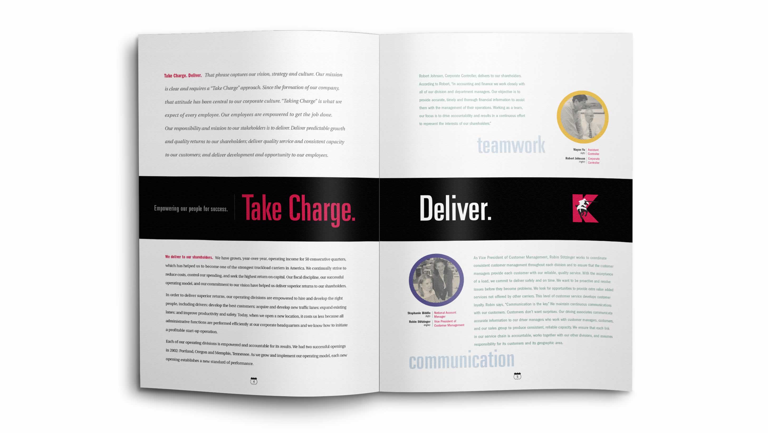
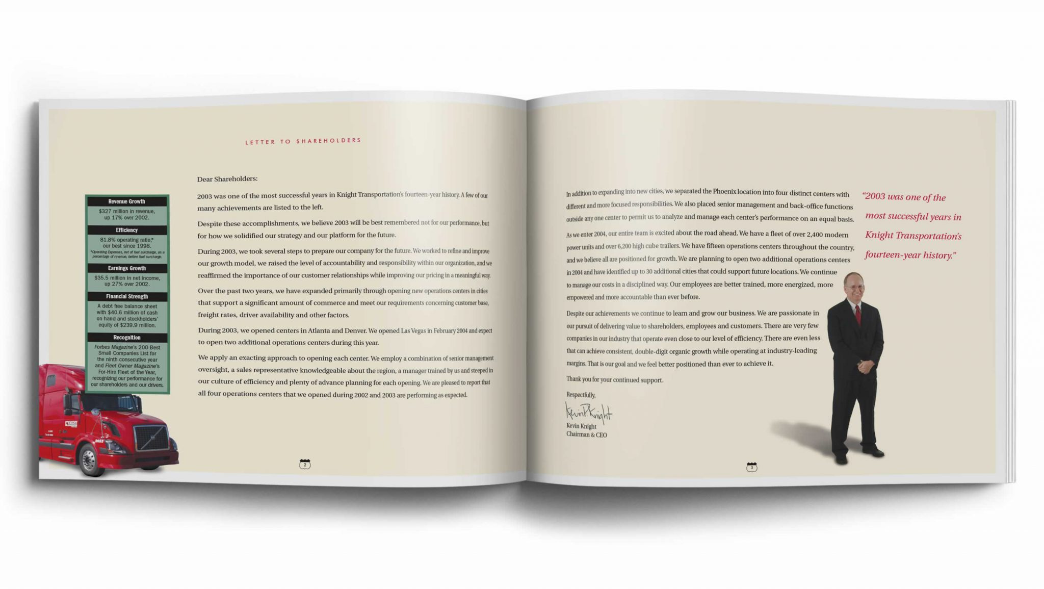
This annual report highlighted Knight’s “Take Charge” approach and its continuing efforts to deliver value to shareholders and offer stable opportunities for its employees.
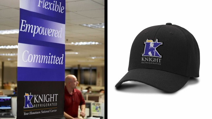
Summation helped Knight Transportation introduce the new logo and identity throughout the company by developing an awareness campaign.
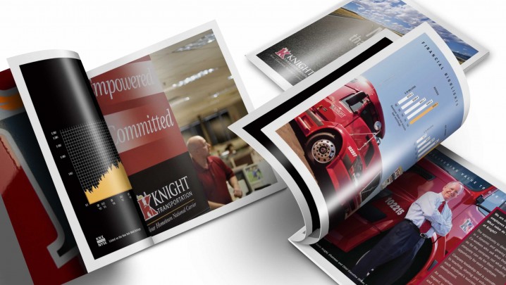
This brochure, incorporating the newly-developed brand, was used as a recruitment tool at job fairs.
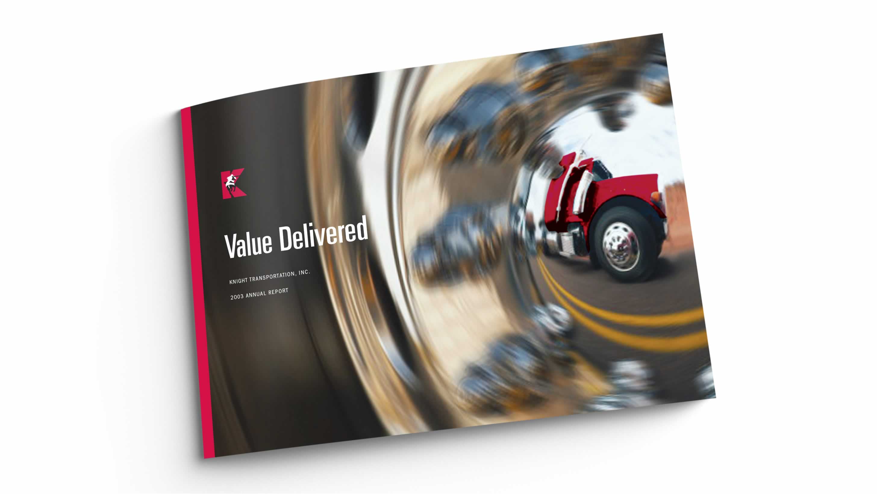
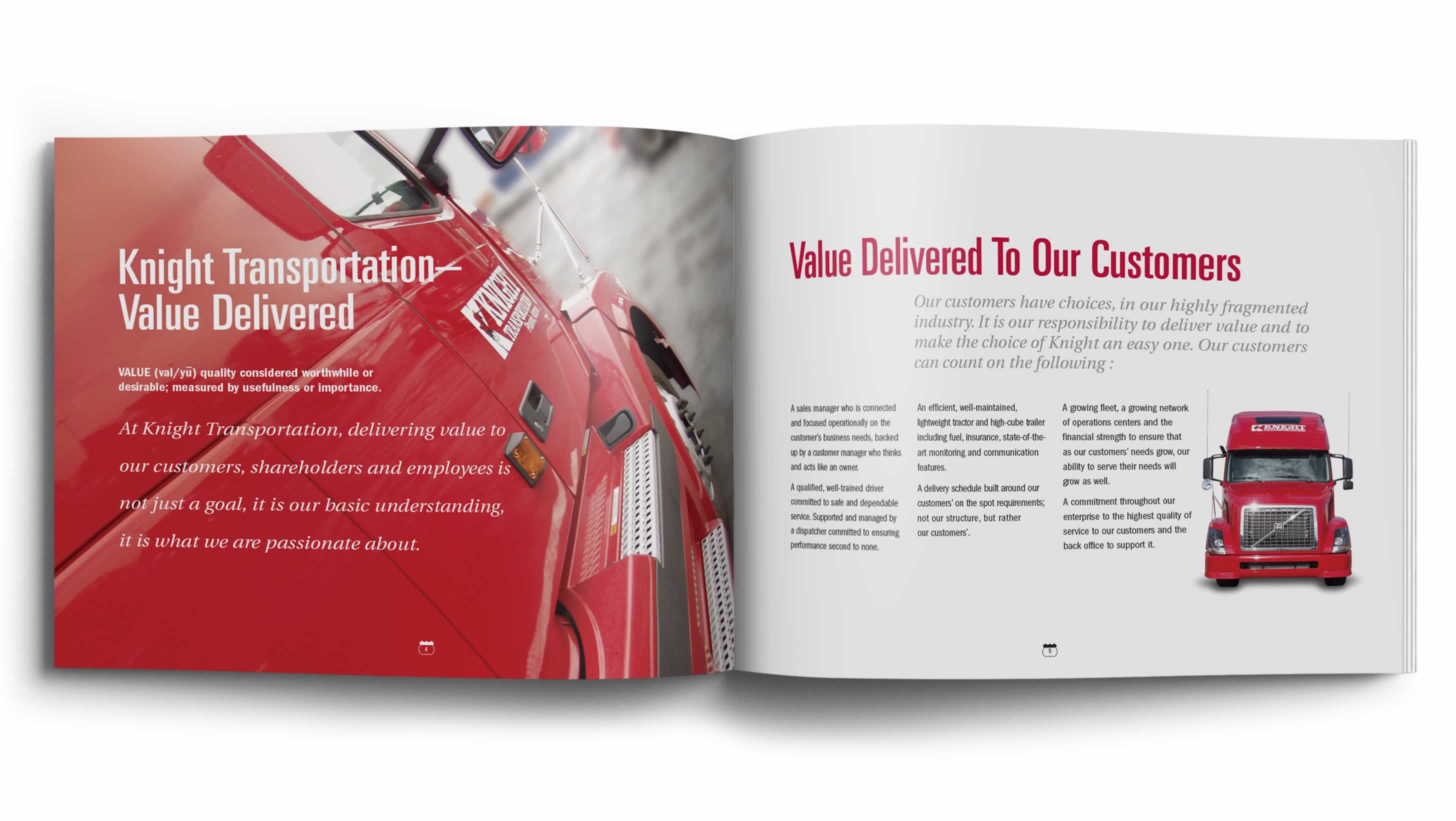
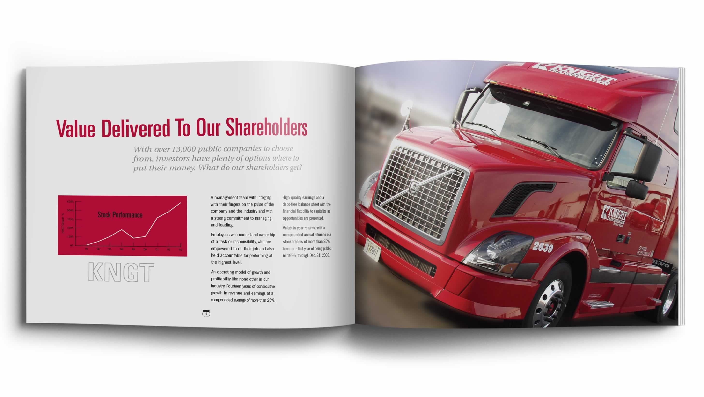
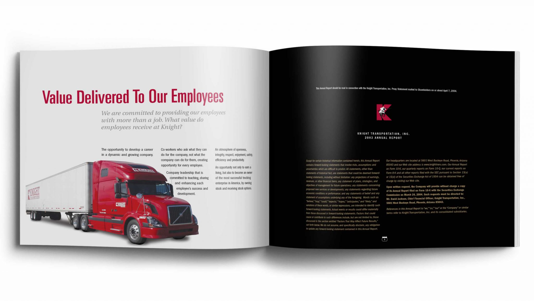
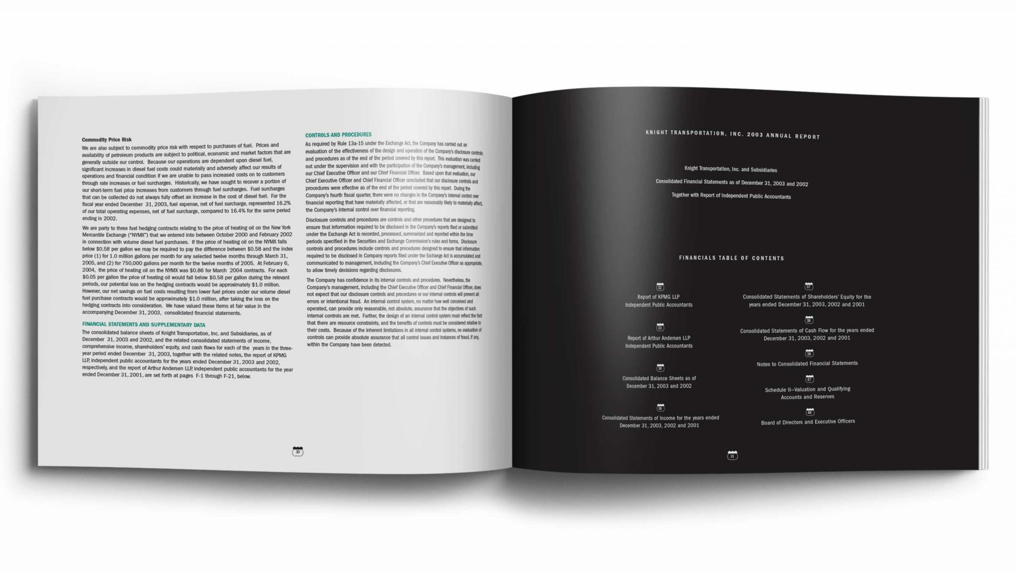
This annual report discusses how value is delivered to shareholders as well as customers.


