Print: 01

Bazi
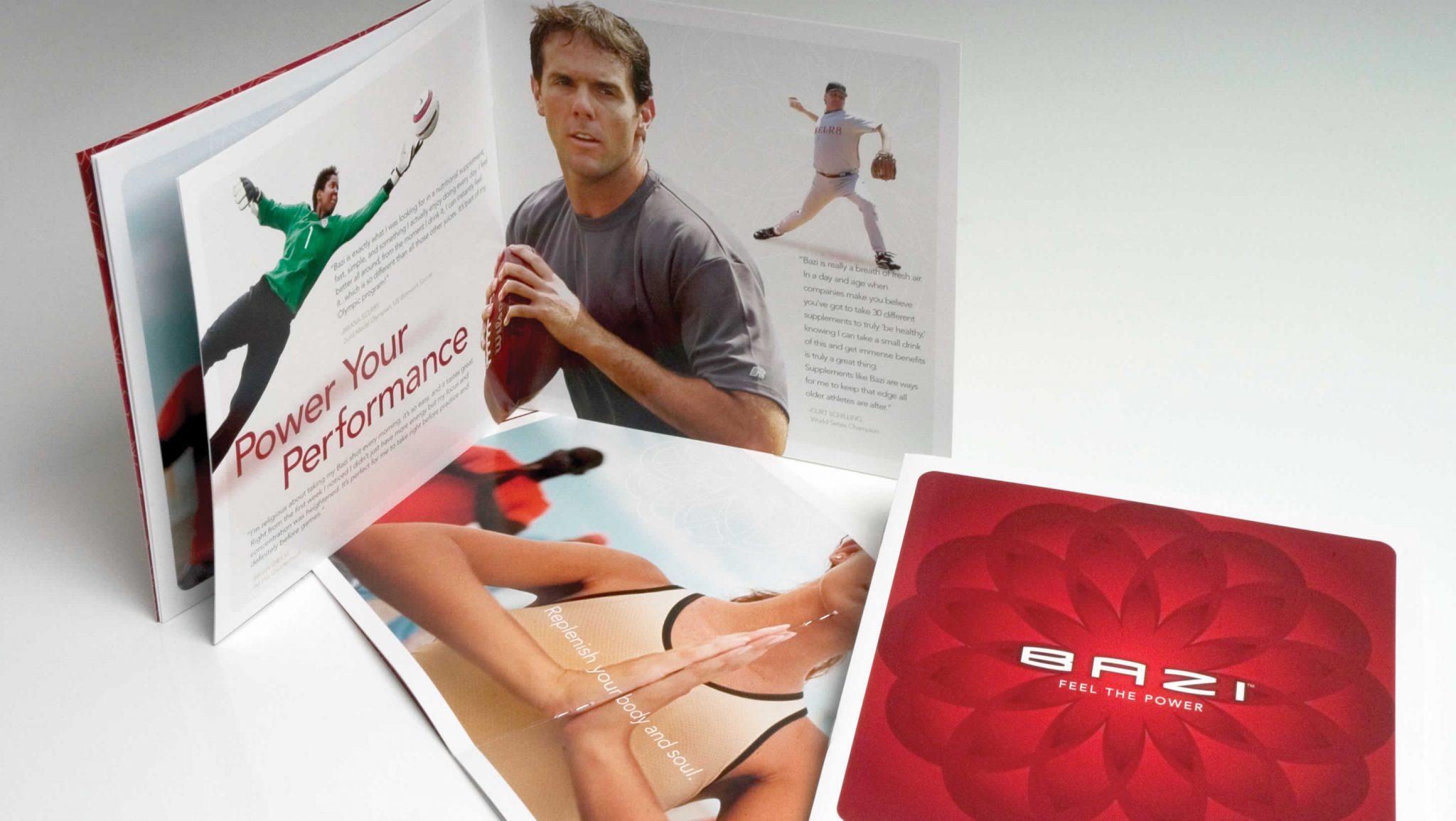
Bazi is a nutritional drink for performance-oriented people. Many professional athletes who used the product were often featured in the company’s marketing materials. See Case Study >

Six Sigma Academy
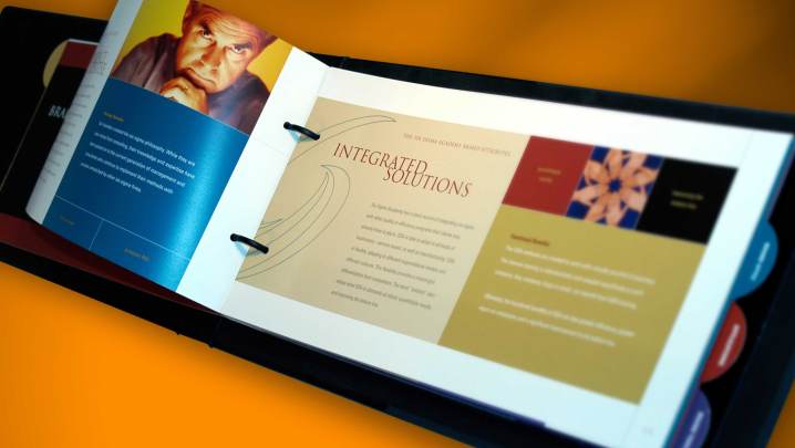
After designing their new identity, Summation developed this brand guide to convey the brand attributes, as well as guidelines, for the new logo. Custom-designed leather binders and tab pages reinforced their unique process. (Client: Six Degrees) See Case Study >
Best Western
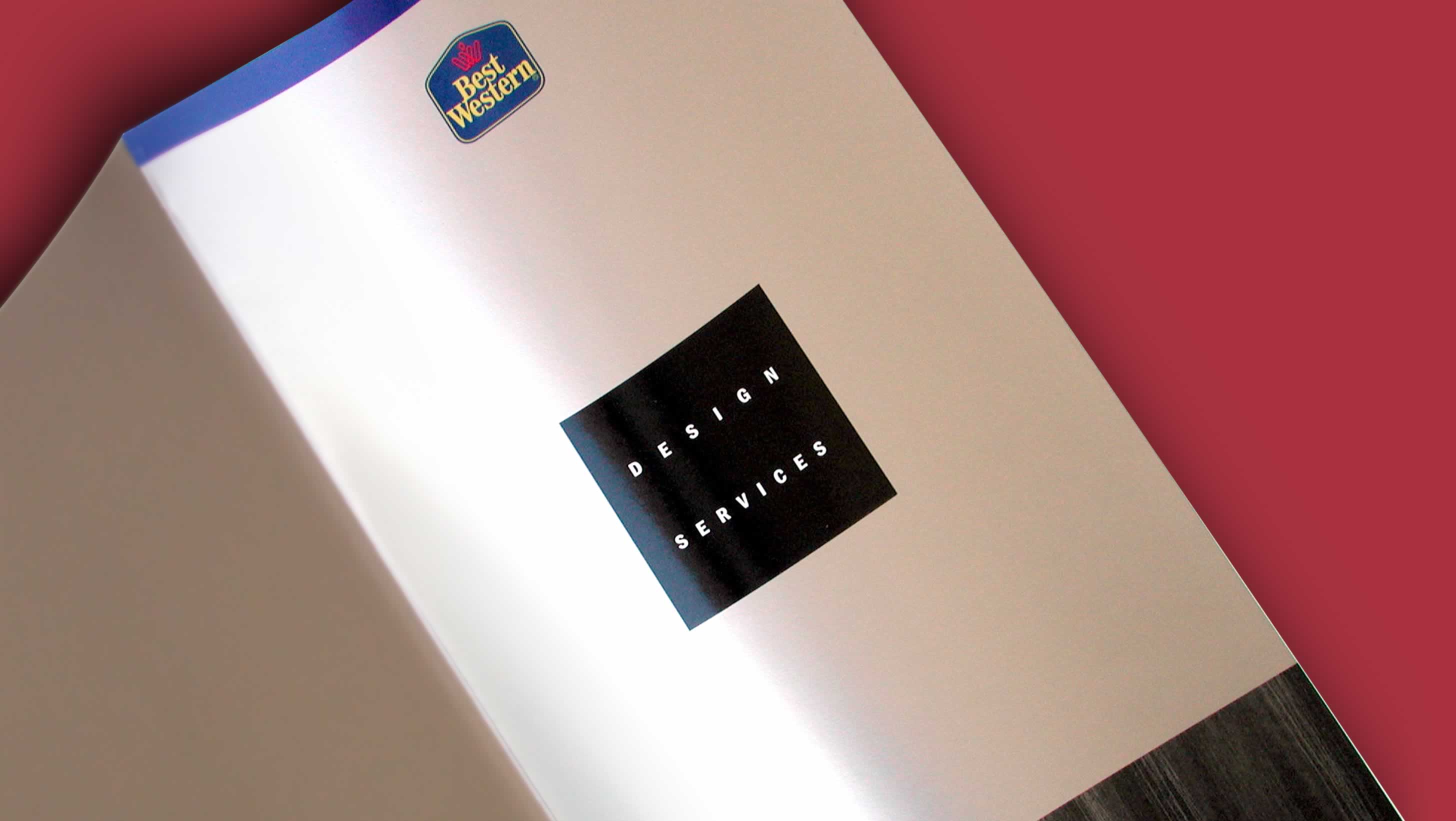
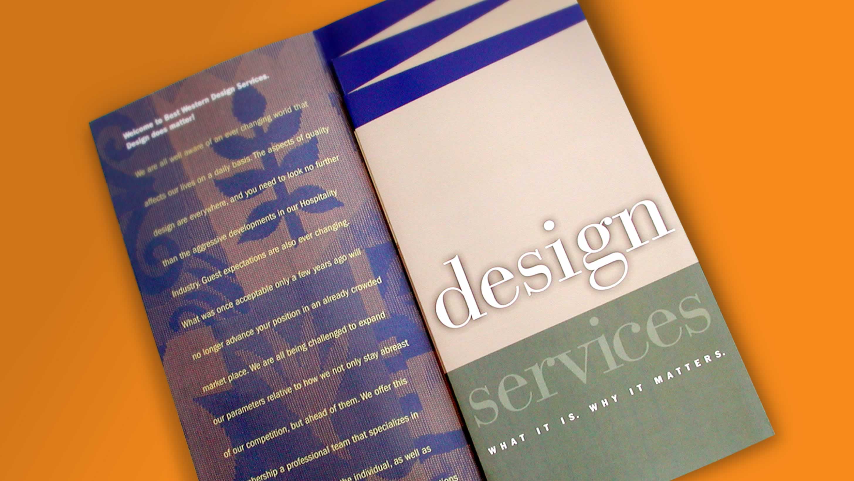
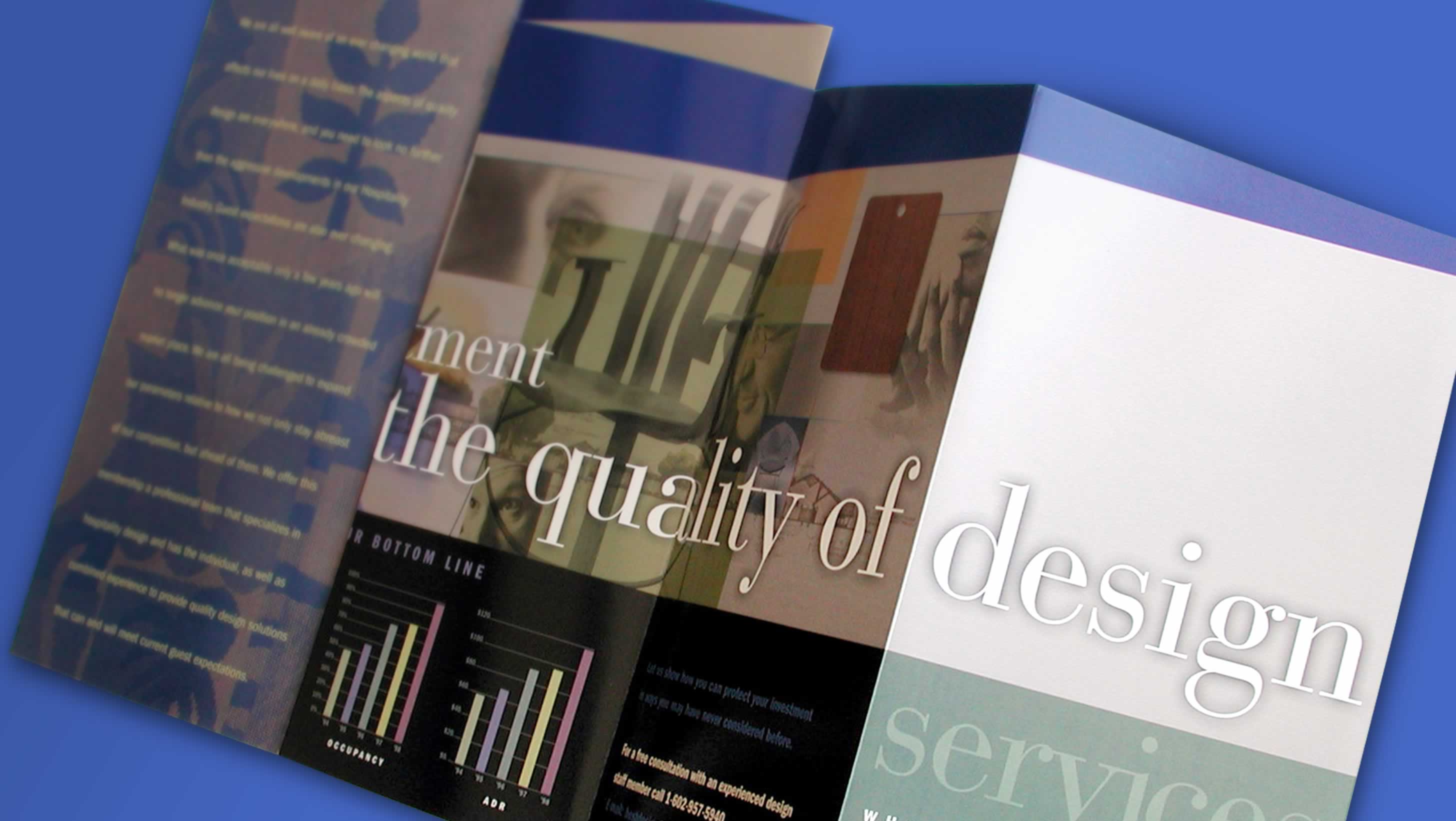
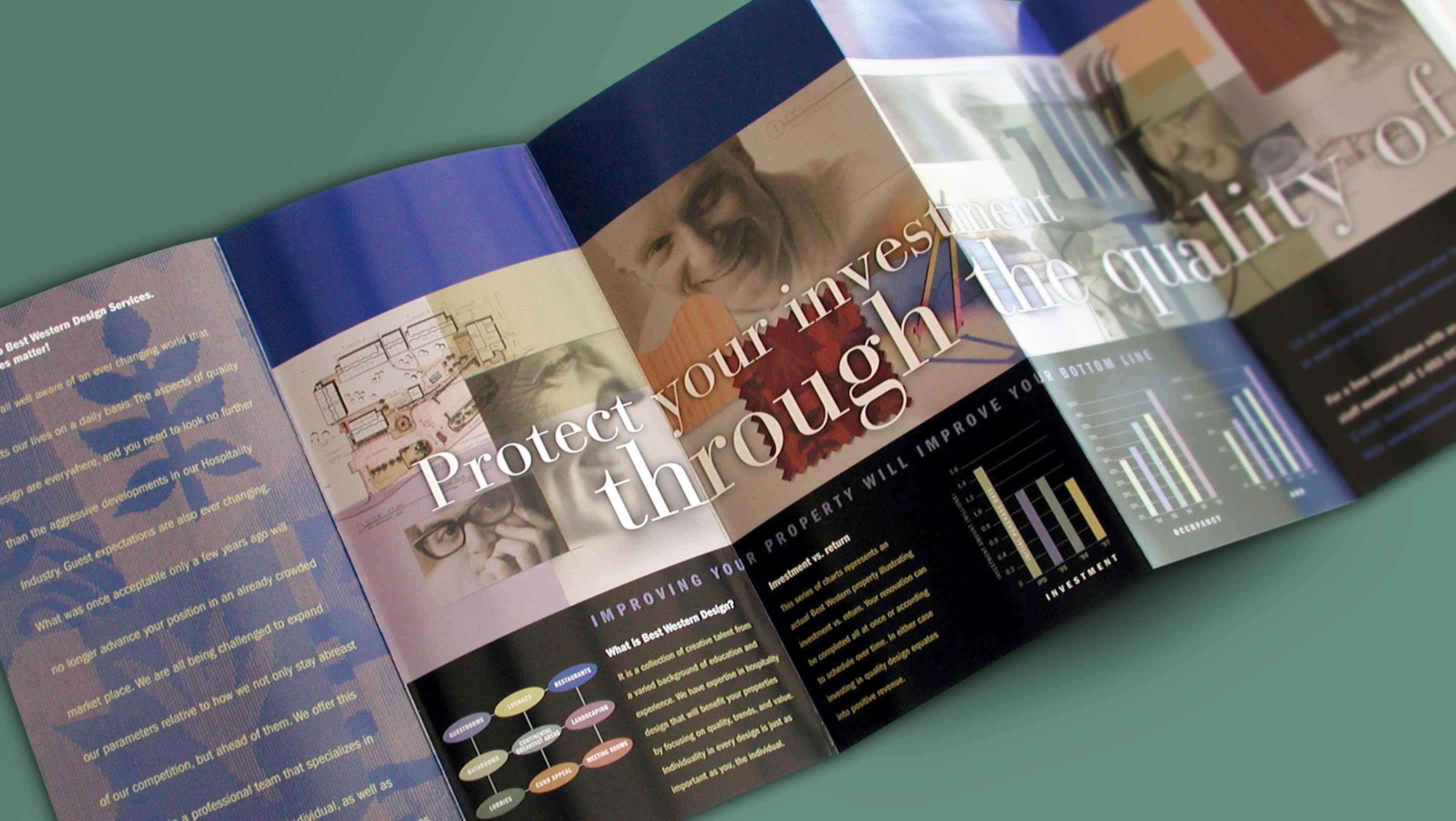
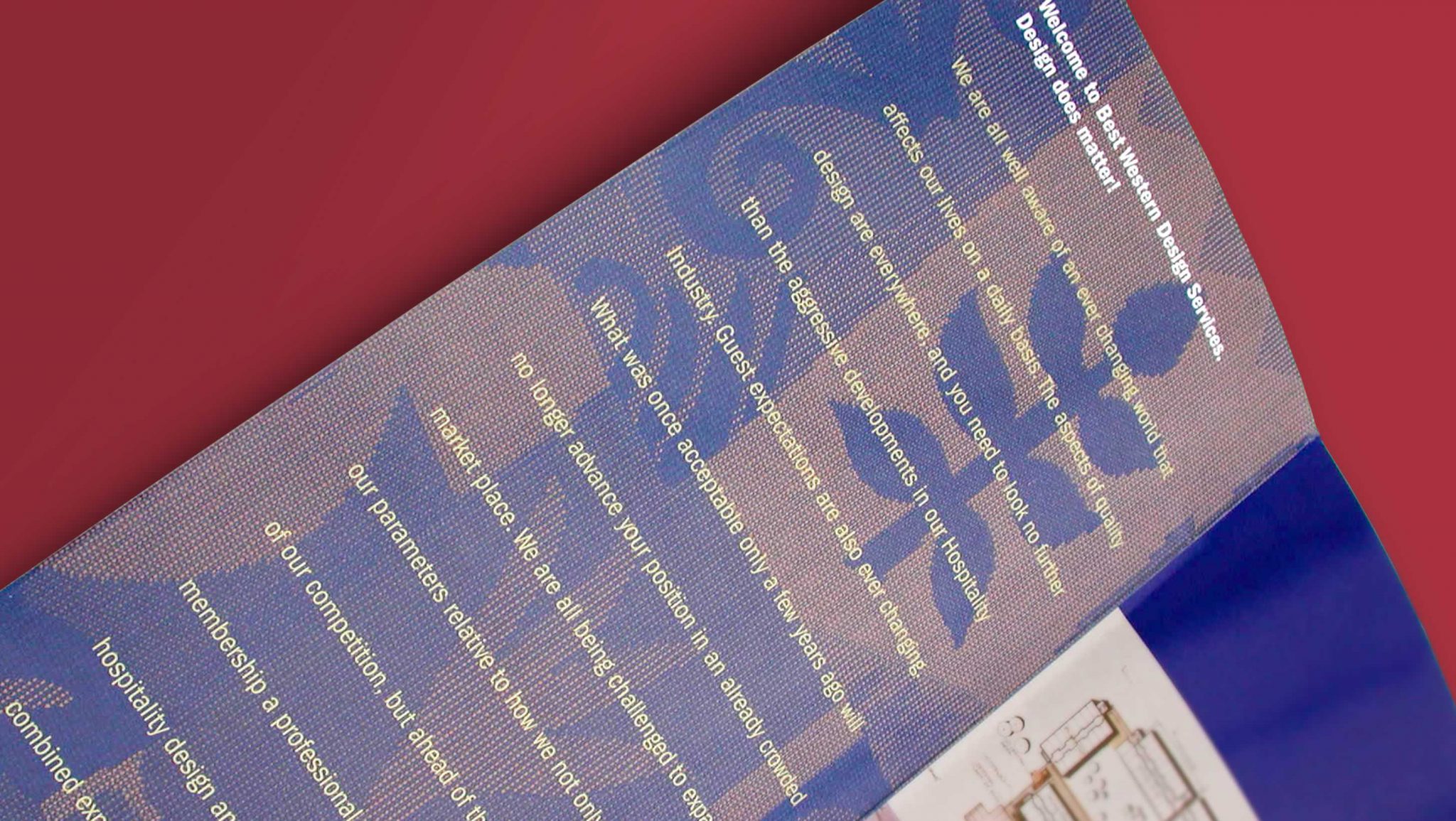
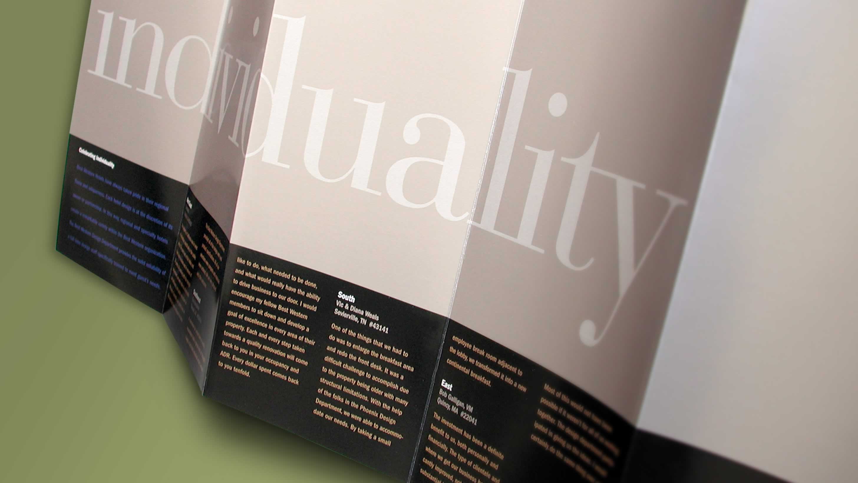
This overview for Best Western’s Interior Design Services division explained company benefits to property owners. A diagonal trim created the sense of architectural perspective when folded.

Honeywell/Petrobras
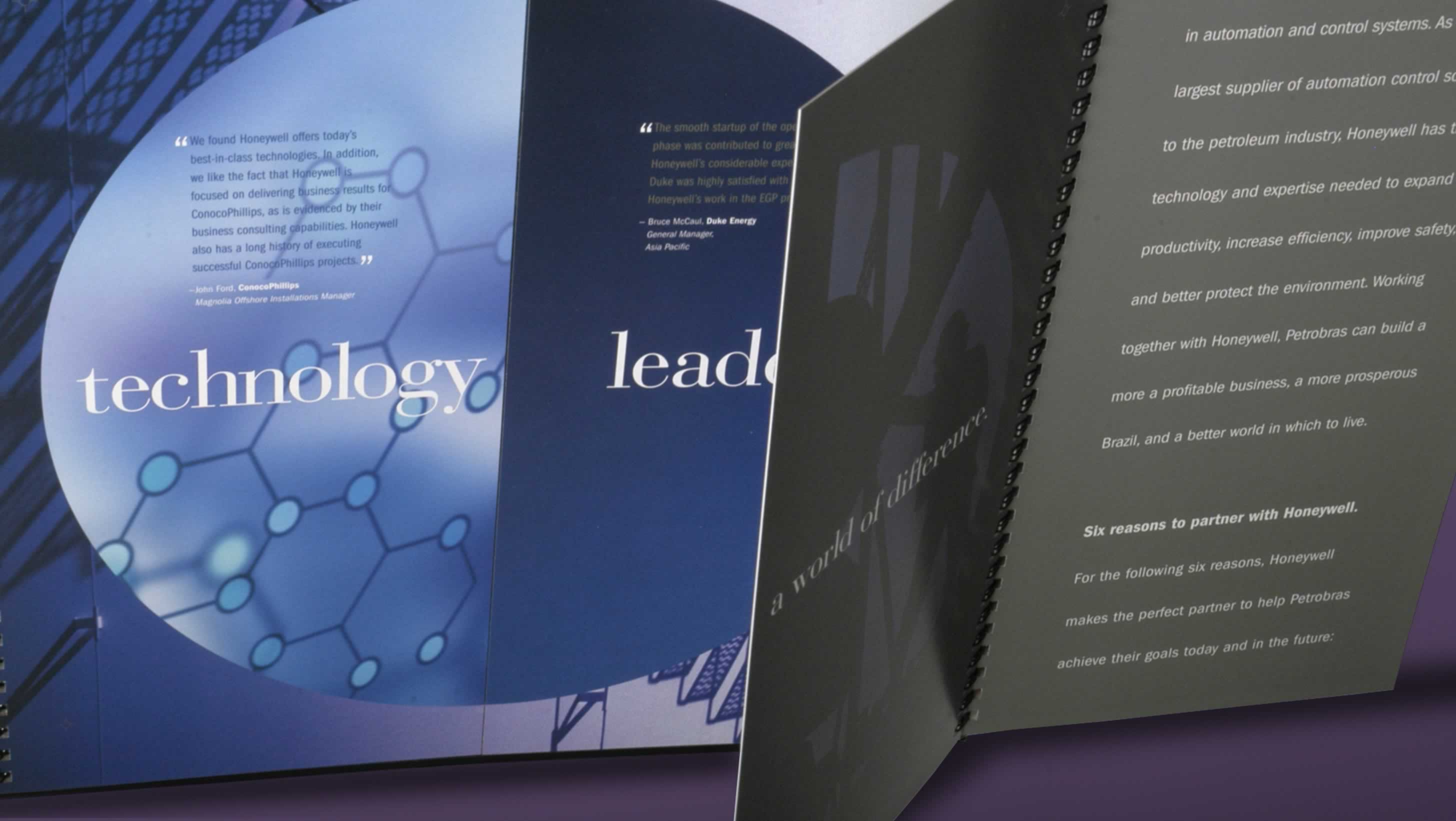
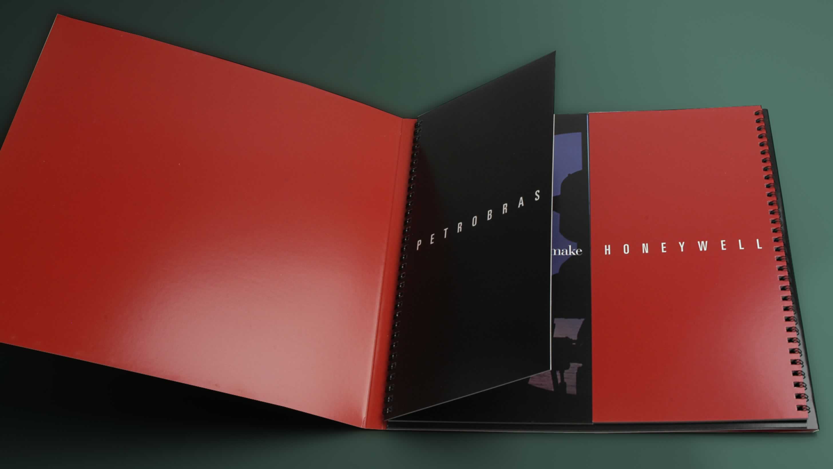
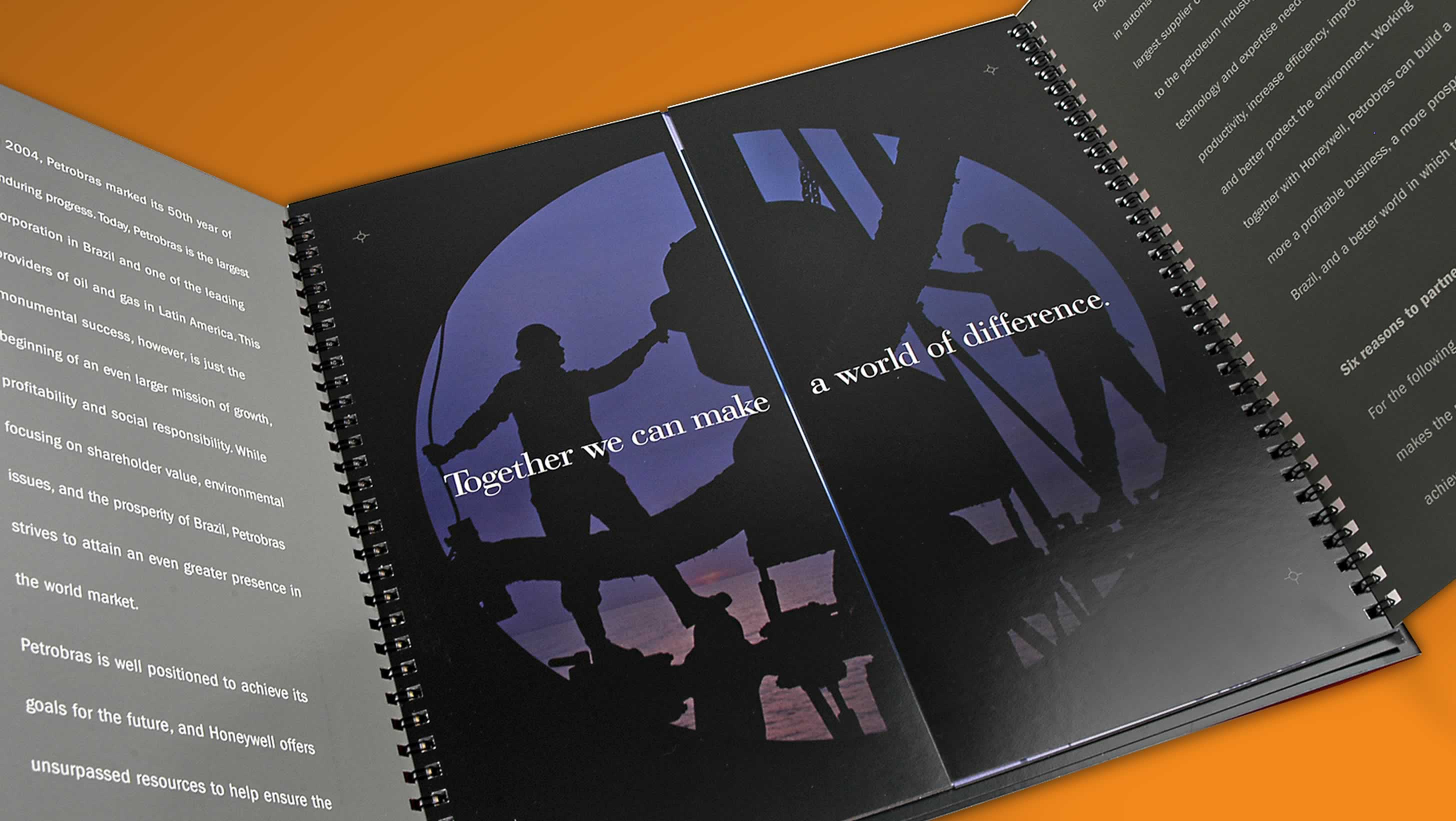
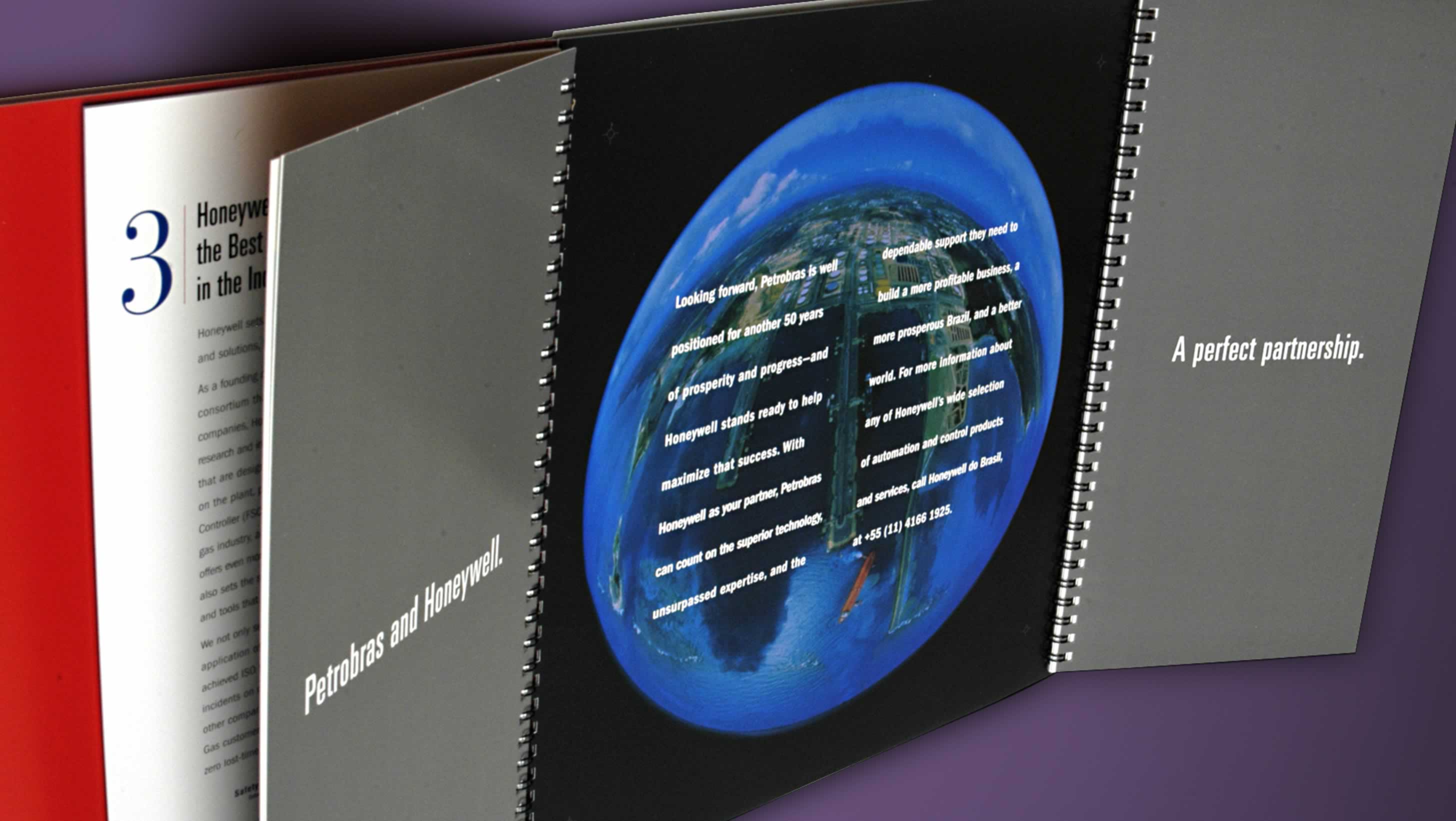
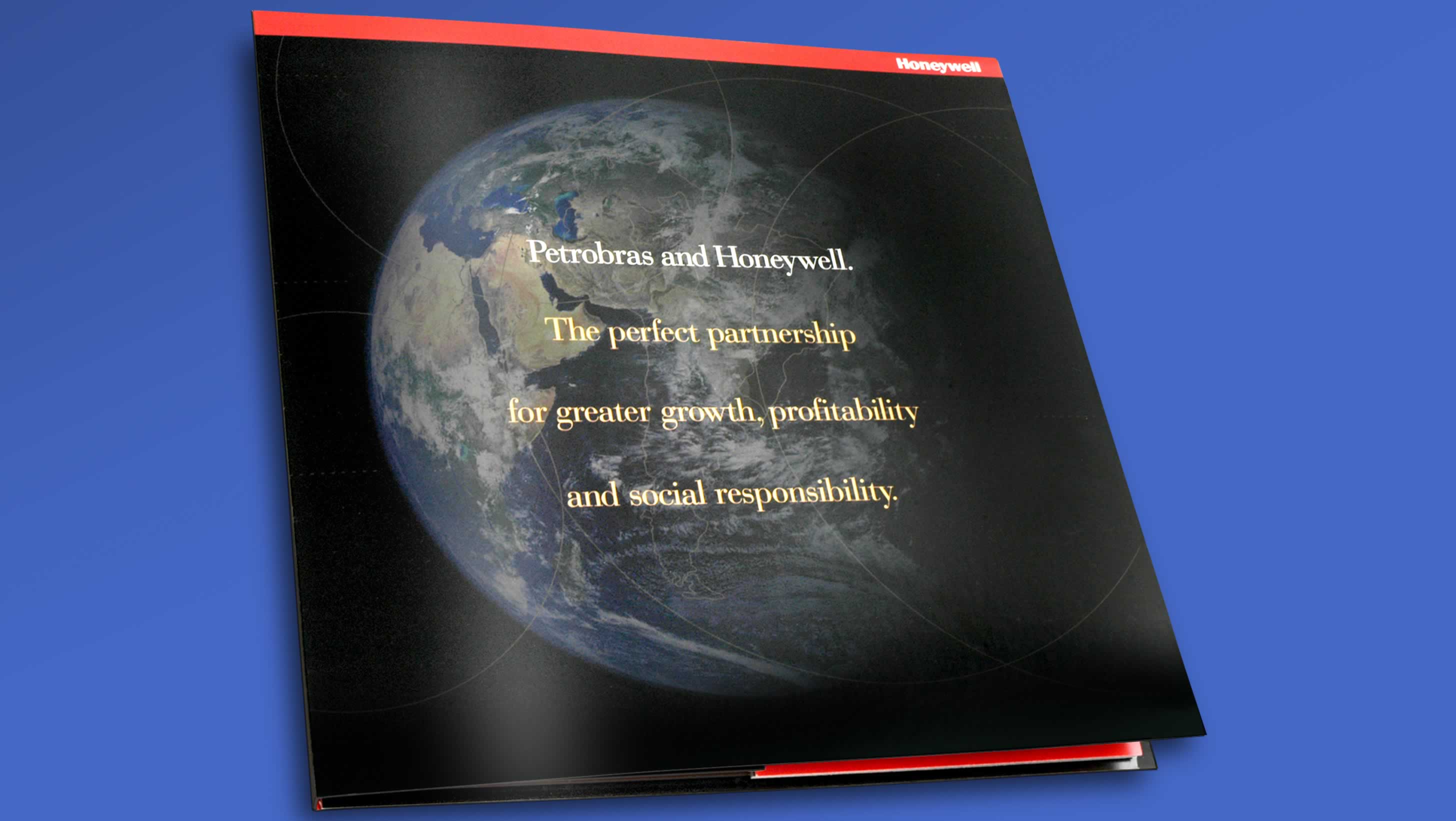
Honeywell asked Summation to develop a communication tool that would best define a joint venture energy project with Petrobras, a Brazilian multinational corporation. Through the use of double-coil binding, imagery and information were able to be viewed in myriad combinations, resulting in photos and words that combined to reveal key benefits. See Case Study >
Vemma
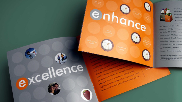
Using the logo form to create a subtle repeating background pattern, this brochure was designed to introduce the company’s new nutritional drink.

VCAT
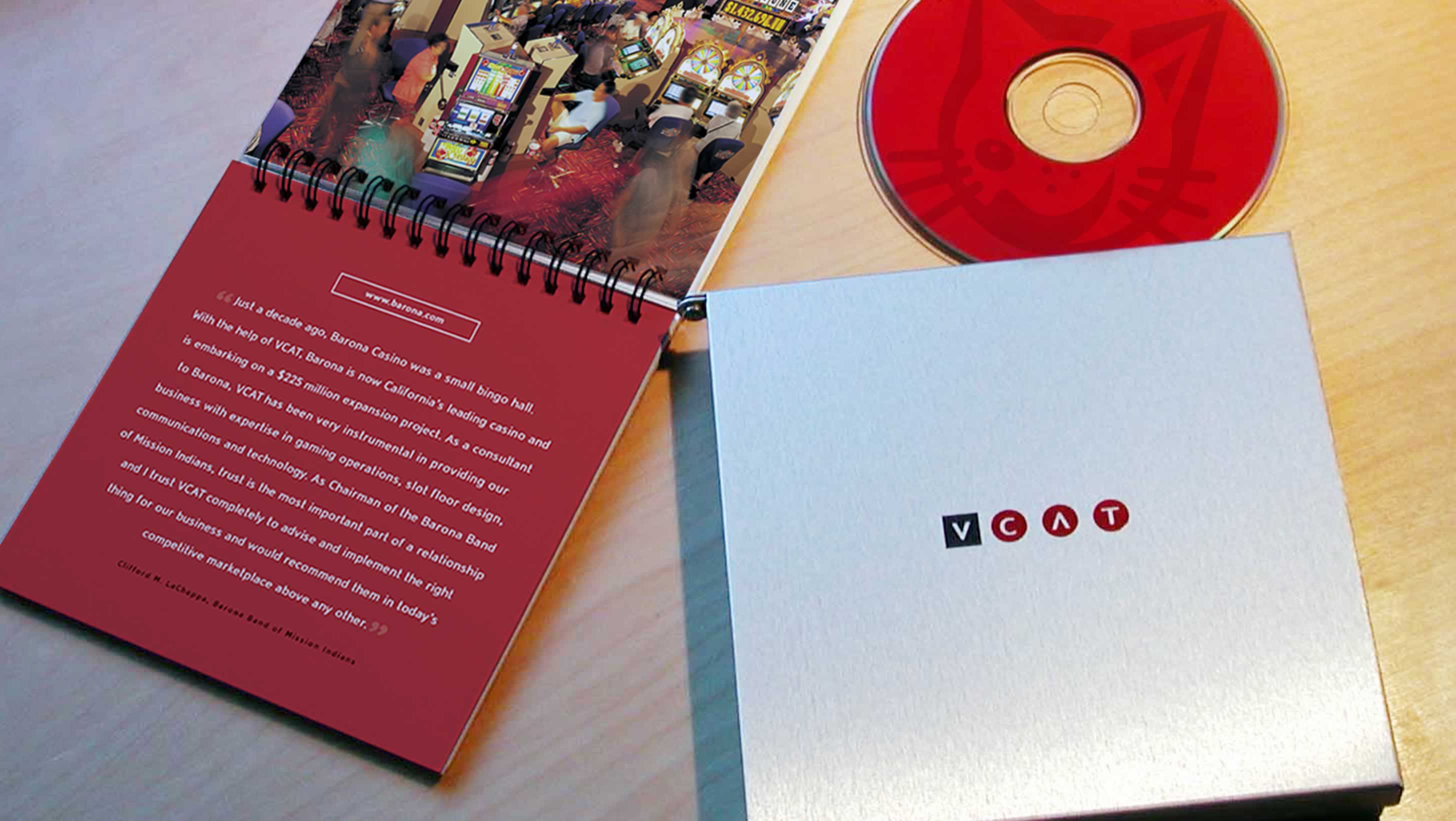
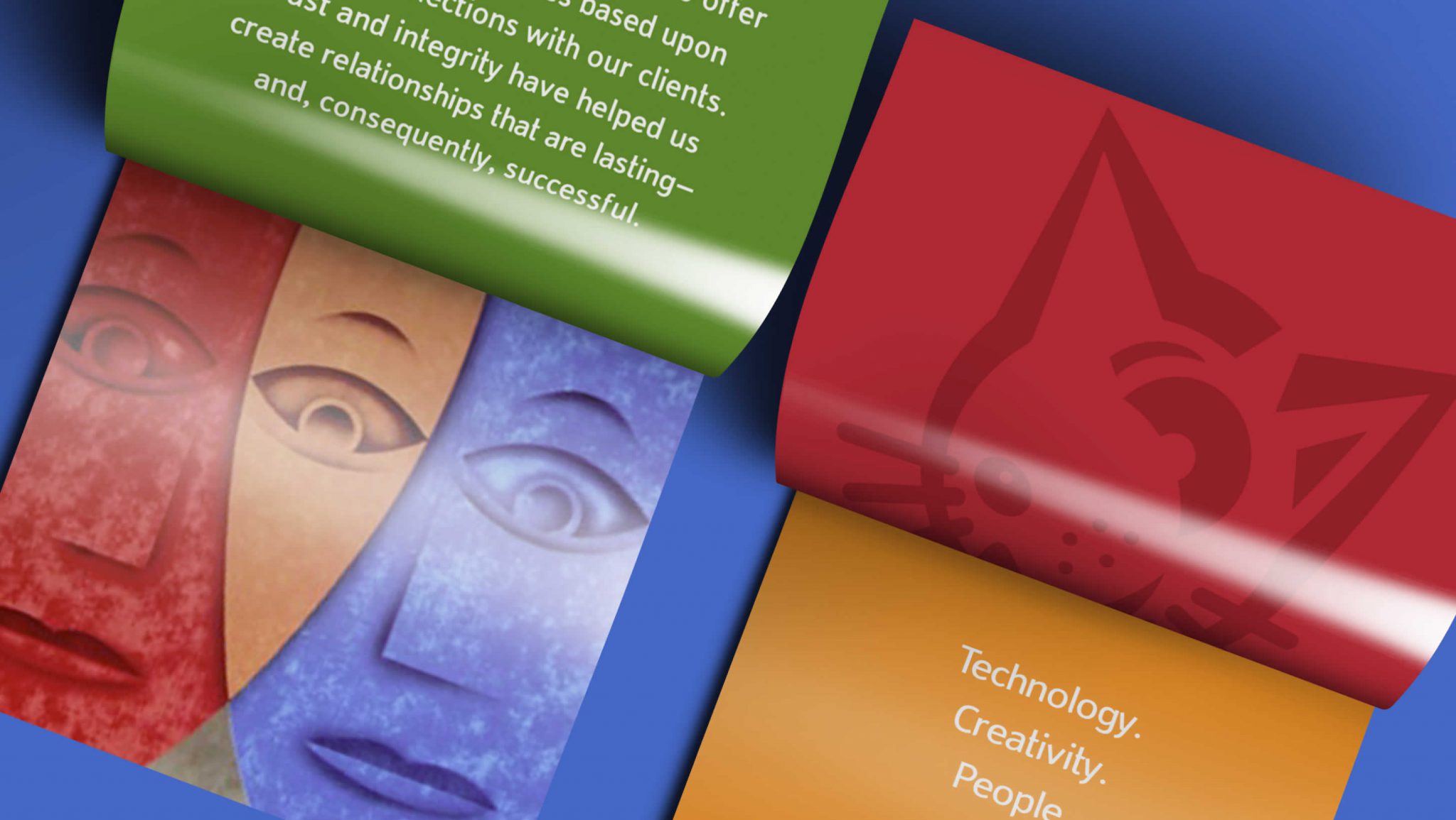
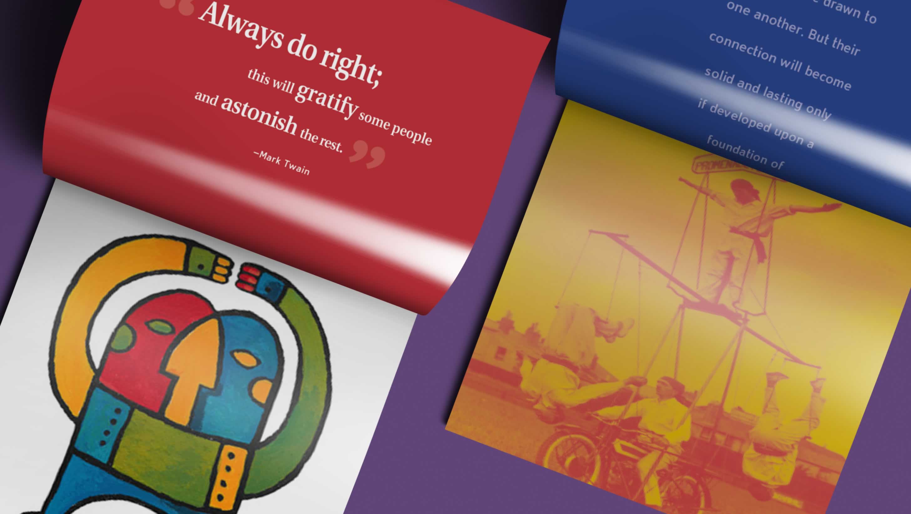
This venture capital firm in southern California wanted to showcase its creative capabilities for growth start-up companies. After creating the new brand identity, Summation designed this custom-made brushed metal packaging that contained a spiral bound brochure and promotional CD.

Bob Carey Photography
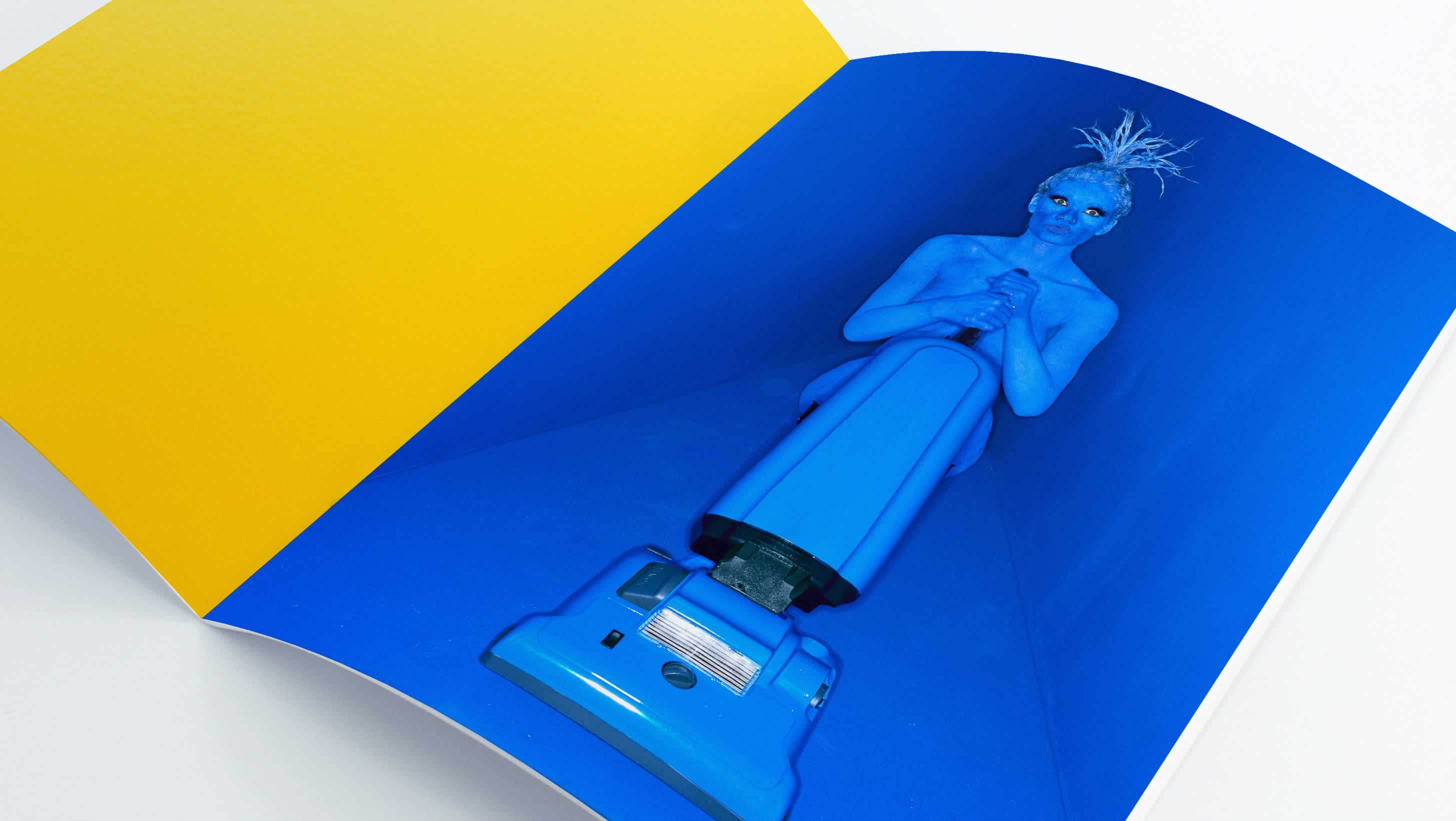
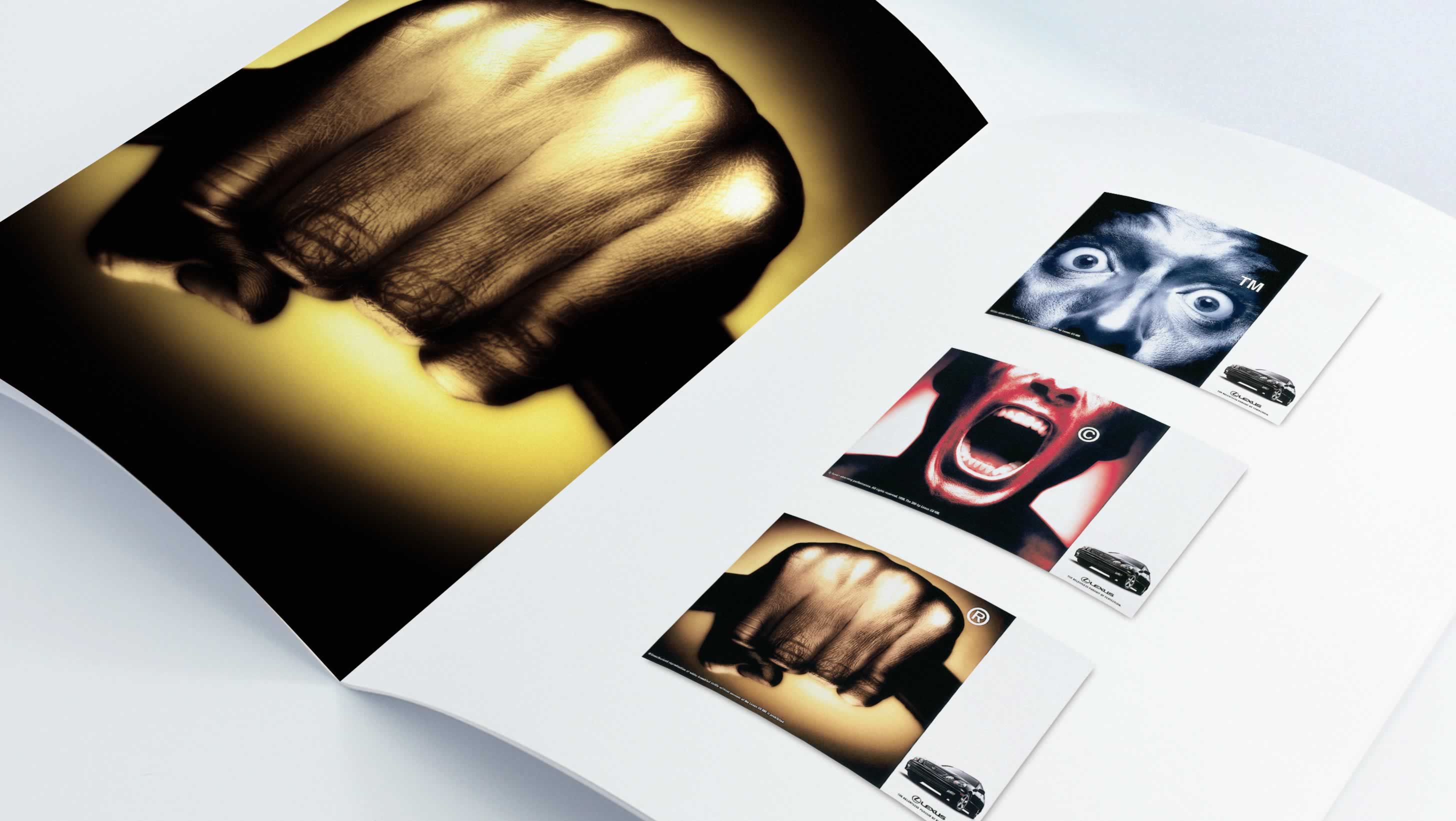
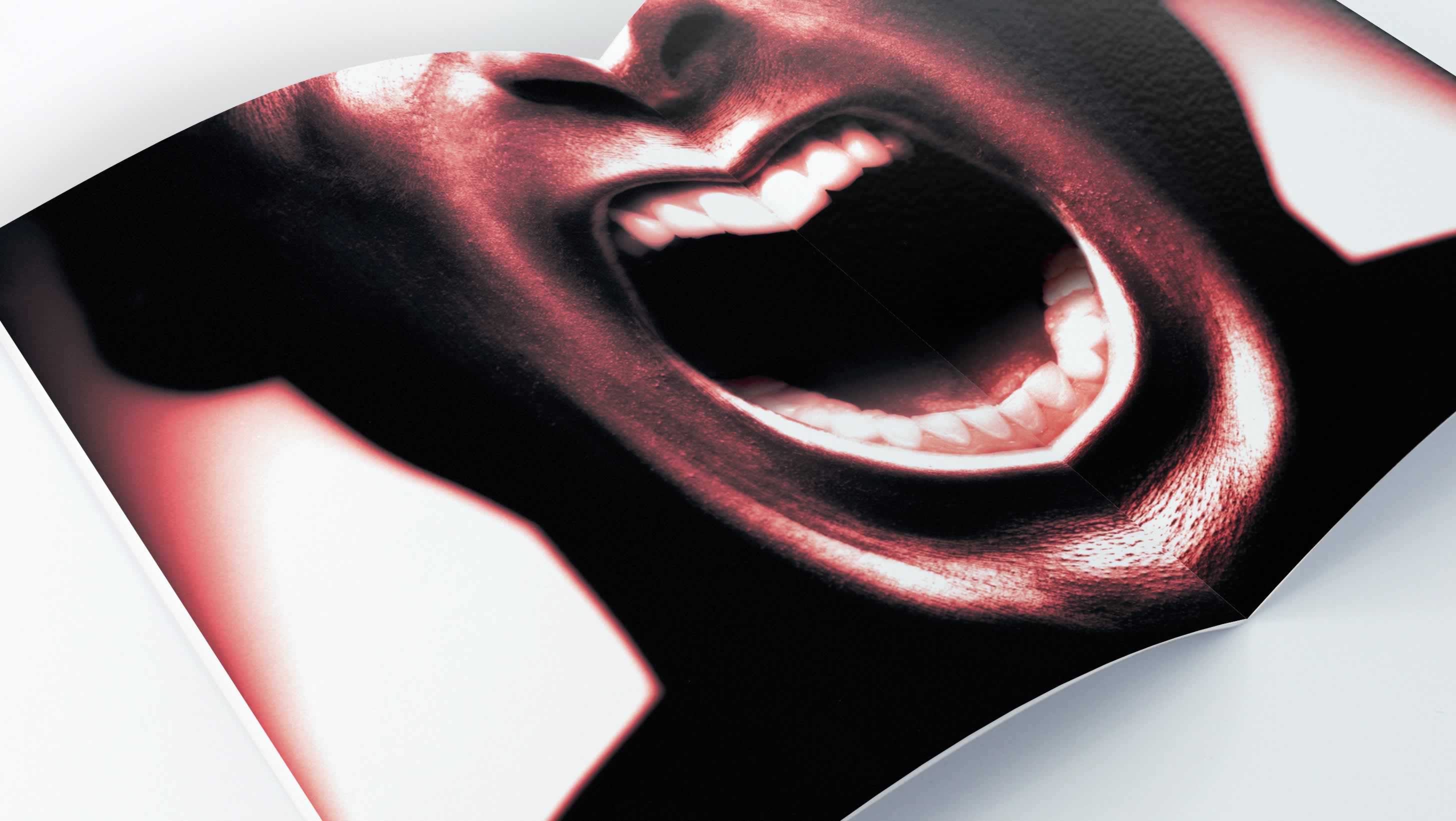
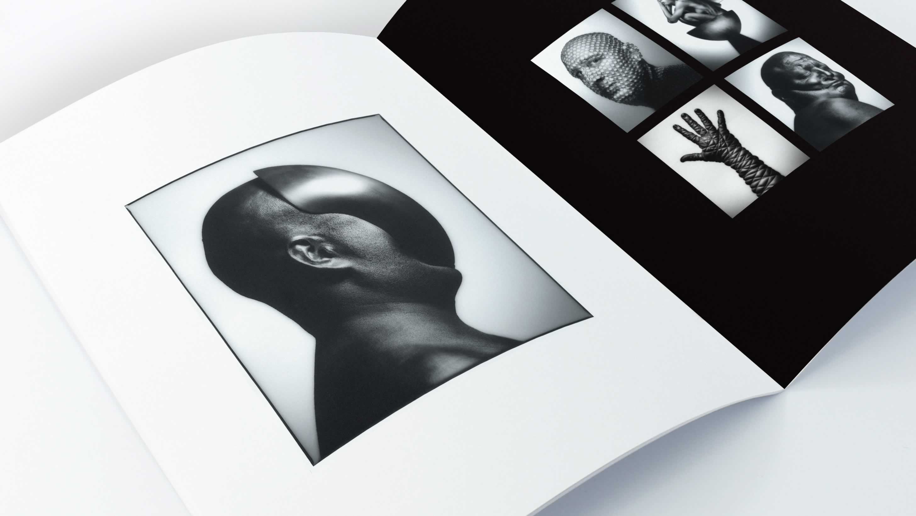
Bob Carey, a professional commercial photographer, wanted to produce a promotional brochure displaying some of his latest work. Summation concepted an oversized, large format that showcased Bob’s big, bold images.


