Swift Transportation
Swift Transportation is the largest trucking company in North America.
Client: DocuPrint Solutions



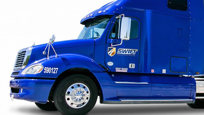
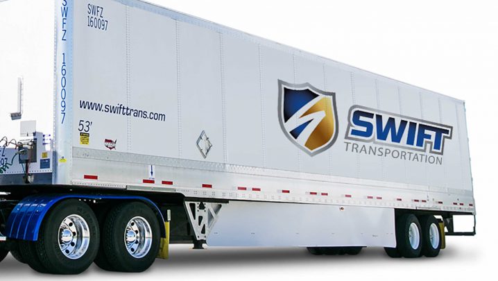

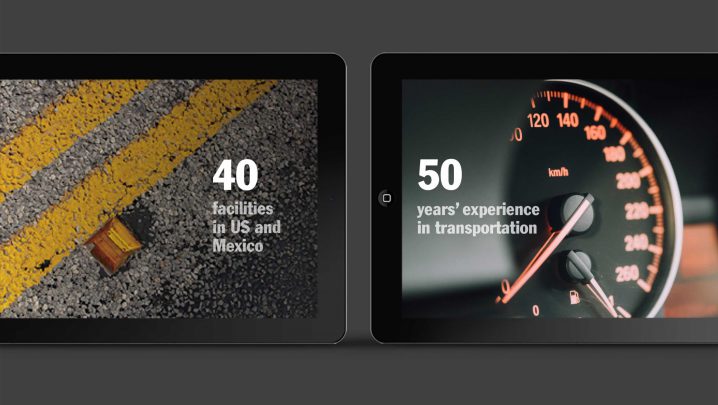



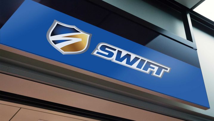


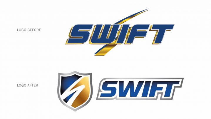
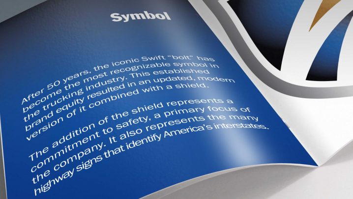

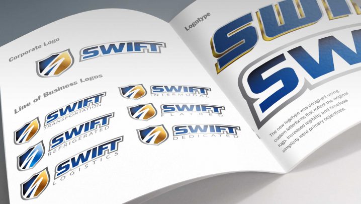
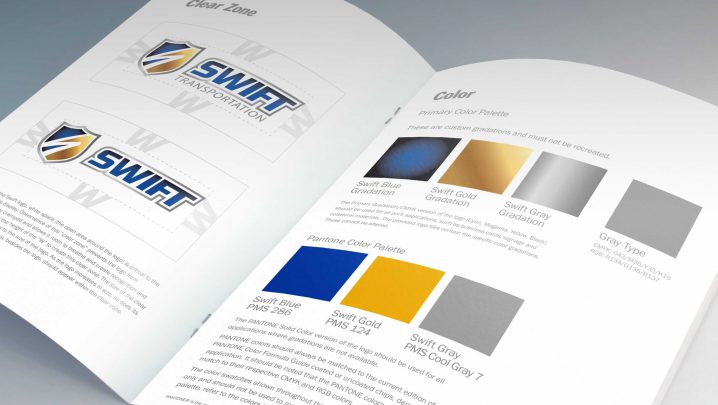
Swift Transportation’s “bolt” symbol had become widely known after 50 years, and the company did not want to abandon the established brand equity. The main colors of blue and gold had also become well-known within their industry. Summation incorporated these elements and designed a more modern, updated corporate identity. A customized logotype was created to reflect the original letterforms yet increase legibilty with a timeless simplicity.

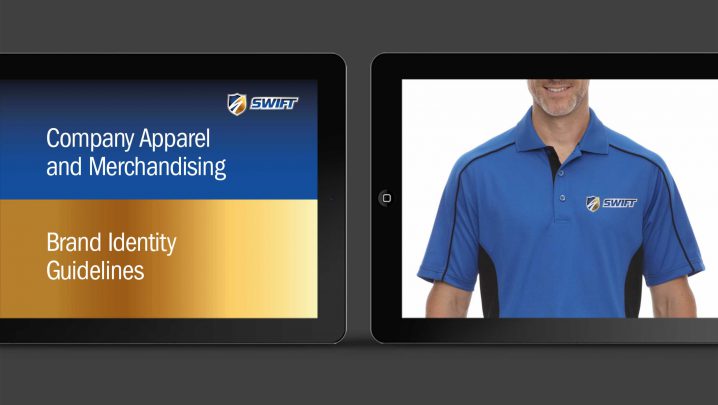
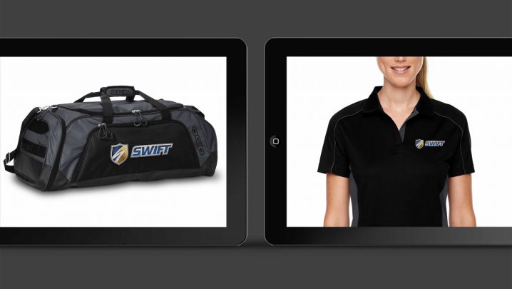

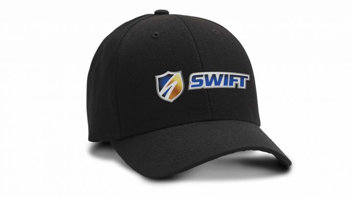

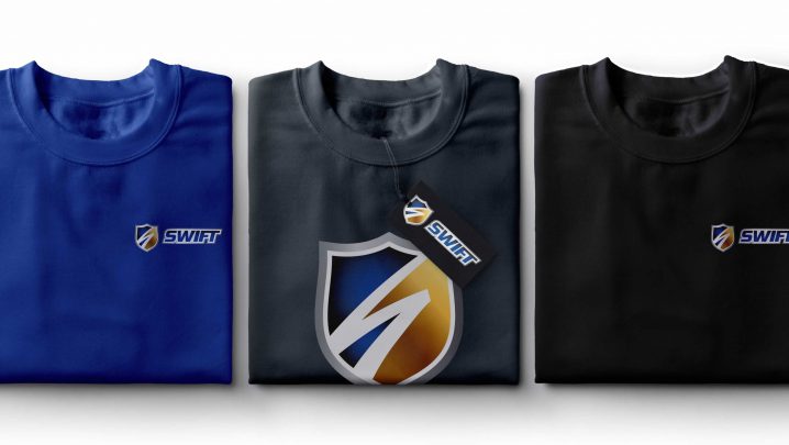
Driver merchandise and apparel were a primary component of the rebranding initiative. An extensive online store offered a large number of branded items. Logo guidelines were developed to represent the identity in a consistent manner across all of them.

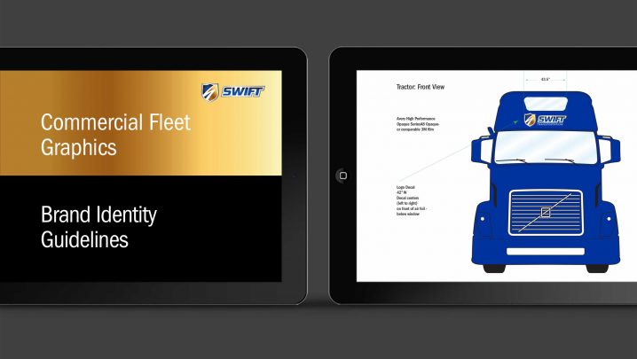
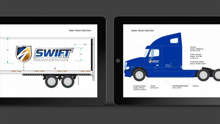

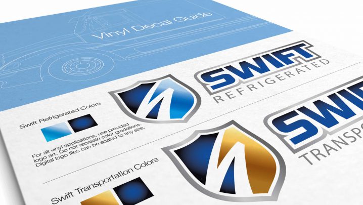
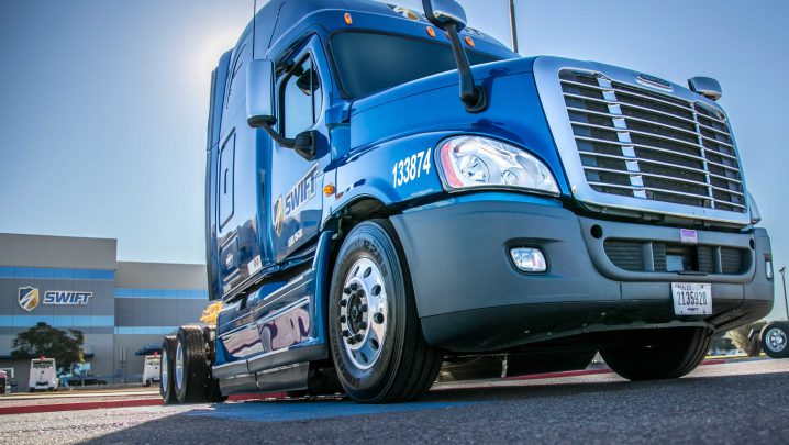
A detailed set of instructions were developed to consistently brand all new trucks with the logo. This process takes several years to implement as older trucks are replaced.


